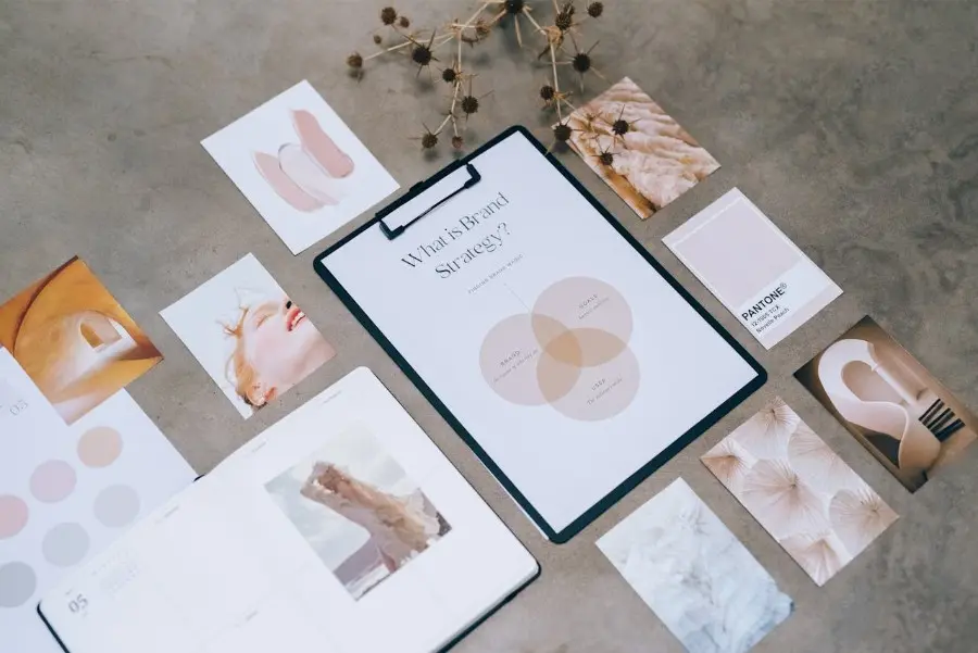
Branded visual content now does far more than decorate a page or fill a social feed. It influences first impressions, communicates brand recognition in seconds, and often determines whether a person scrolls past, clicks through, shares, or remembers what they saw.
That is why visual content has become a strategic layer of both social performance and search visibility.
On social platforms, visuals need to stop attention quickly and communicate value almost instantly. In search, visuals support discoverability, reinforce topical relevance, improve shareability, and strengthen how a page is understood across the wider web. In an AI-first environment, that same visual layer also affects how consistently a brand appears across pages, preview images, campaigns, and summaries.
For most teams, the challenge is not creating one attractive image. It is creating a repeatable system that keeps visuals clear, branded, technically sound, and adaptable across channels.
That is where a platform like Pixelixe becomes especially useful. Instead of treating every image as a one-off design file, teams can build the first layout in Pixelixe Studio, keep fonts, logos, colors, templates, and design rules aligned in Brand Kit, and then scale that approved creative across campaigns with creative automation, social media graphics workflows, and the Image Generation API.
Understanding Audience Expectations
Successful branded visuals start with a clear understanding of the audience and the context in which the image will appear.
Different platforms create different expectations. Social media users often respond best to fast, instantly readable visuals that communicate a message in a second or two. Search-driven visitors tend to value relevance, clarity, and usefulness more than novelty alone. A visual supporting a blog article, landing page, or product page needs to help the user understand the content more quickly, not simply look attractive.
This is why performance starts before design execution. Teams need to know:
- who the image is for
- where it will appear
- what the user needs to understand immediately
- what action the image is meant to support
When those questions are clear, the design becomes easier to shape and the message becomes easier to land.
Build Visual Systems, Not Just Individual Graphics
One of the biggest mistakes brands make is treating visual production as a series of disconnected tasks.
That often leads to inconsistent layouts, mismatched typography, uneven quality, and slow turnaround when the same campaign needs to appear in multiple formats. A stronger approach is to build reusable visual systems instead of repeatedly creating assets from scratch.
This is one of Pixelixe’s biggest strengths. Teams can create the first approved layout in Studio, save it as a reusable template, and then generate variations across platforms, products, regions, and campaigns without breaking consistency. That system becomes especially valuable when a single campaign needs to exist as a blog header, social post, email visual, paid banner, and route-specific share image.
That kind of repeatable visual logic helps brands move faster while protecting quality.
Aligning Visuals With Brand Identity
Brand identity remains one of the strongest long-term assets a company can build.
The most effective visuals do not rely only on placing a logo in the corner. They use recognizable design choices: color systems, typography, spacing, composition, and image treatment. When those elements are consistent, users begin to associate the visual language with the brand even before they consciously process the name.
That does not mean every asset must look identical. It means each one should feel like it belongs to the same system.
Pixelixe is well suited to that challenge because Brand Kit is designed to keep reusable rules aligned while teams continue producing assets at scale. Instead of relying on memory or repeated manual setup, teams can build a more reliable layer of brand governance around the creative itself.
Ensuring Technical Optimization For Search
Branded images do not perform well in search by design quality alone. They also need technical clarity.
That means paying attention to:
- meaningful filenames
- useful alt text
- strong surrounding page context
- image dimensions that fit the page layout
- compression and file-size efficiency
- relevant placement near helpful text
This is one reason visual content should be treated as part of the page’s information architecture, not as an afterthought. Search systems understand images more effectively when they are supported by the page title, headings, nearby copy, and clean HTML implementation.
For example, working with an established SEO agency from Ottawa can help businesses refine the broader structure around image discoverability, but the visual workflow itself also matters. If the team cannot consistently produce optimized, context-relevant, on-brand assets, technical recommendations are much harder to execute over time.
Designing For Clarity And Simplicity
Clarity is one of the strongest predictors of visual performance.
On social media, users move quickly. On search-driven landing pages, users are often scanning for confirmation that the page matches their intent. In both cases, clutter hurts performance. If the message takes too long to understand, the visual loses value.
That is why strong branded visuals usually rely on:
- one clear focal point
- readable typography
- limited visual competition
- obvious hierarchy
- enough spacing to make the message easy to process
Simple does not mean generic. It means that the primary point is obvious.
This is also one reason template-based workflows tend to outperform improvised design under pressure. When the structure is already strong, teams can focus on the variables that matter instead of rebuilding hierarchy every time.
Optimizing Visuals For Different Platforms
A visual that works on one platform may not perform well on another.
Social channels often favor square and vertical formats. Blog and search-oriented pages may benefit from wider supporting images. Open Graph previews need different proportions from email banners. Display ads, lifecycle images, and CRM visuals all have different constraints.
Resizing alone is not enough.
The layout often needs to adapt so that the key message, CTA, or focal image still works in the new format. This is where reusable templates and automation become especially valuable. Pixelixe helps teams generate banner variants, ad banners, and social graphics from approved visual structures instead of resizing each version manually.
That makes the workflow much more scalable when campaigns expand across channels.
This also makes file-size optimization easier to operationalize. Platform-specific output becomes more realistic when the team can systematically control formats, exports, and image variants instead of handling everything by hand. That is particularly relevant when performance depends on image speed and file sizes across multiple publishing surfaces.
Using Text Strategically In Visuals
Text inside visuals can improve clarity, but only when it is used carefully.
A short headline, offer statement, category label, or CTA can help users understand the purpose of the image immediately. Too much text, on the other hand, can make the design feel crowded and reduce visual impact.
The strongest visual text usually does one of three things:
- clarifies the value proposition
- adds context the image alone cannot provide
- directs the viewer toward the next step
That text should support the visual, not compete with it. Good hierarchy matters here just as much as wording.
For teams producing many content-driven images, Pixelixe can help standardize these text fields through reusable templates and structured inputs. That is especially useful when headlines, subheads, prices, product names, or localized copy need to change regularly.
Incorporating Storytelling Elements
Strong visual content often performs better when it feels like part of a larger narrative rather than a series of disconnected assets.
That can take several forms:
- a recurring campaign motif
- a recognizable series format
- a sequence of visual explanations
- a multi-post story arc
- a repeated structure across related content
Storytelling improves memorability because the audience is not only reacting to one graphic. They are learning a pattern.
For brands, this matters because repeated visual logic makes content easier to recognize across feeds, landing pages, newsletters, and search-driven content ecosystems. Pixelixe supports this well because the same approved template system can be reused across multiple assets without forcing the team to redesign each chapter of the story from zero.
Balancing Creativity With Performance Metrics
Creative quality matters, but it becomes much more useful when paired with measurable feedback.
Brands should review how visuals perform through metrics such as:
- engagement rate
- click-through rate
- conversion rate
- share rate
- dwell-related content performance signals
- asset fatigue across campaigns
The point is not to reduce design to numbers. It is to use data to understand which messages, layouts, and visual patterns are actually helping.
This is where repeatable production becomes a real advantage. If the team can generate new variants quickly, it can test more hypotheses. If every change requires a full design restart, testing becomes slower and more expensive.
Maintaining Consistency Across Campaigns
Consistency is one of the most underrated drivers of performance.
When users encounter aligned visuals across blog posts, social media, product pages, emails, and search-driven landing pages, the brand becomes easier to remember. The experience feels more coherent. Trust grows more easily because the message appears intentional rather than fragmented.
This is especially important for brands publishing frequently. Without a system, content quality often becomes inconsistent as volume increases.
Pixelixe helps prevent that drift by turning the first approved layout into a reusable system. That means one campaign can produce a family of related visuals without losing the design logic that made the original asset strong.
Leveraging User Generated Content Without Losing Brand Coherence
User generated content can strengthen credibility because it often feels more authentic than traditional brand creative.
But it works best when it is curated thoughtfully. UGC should still align with the brand’s positioning, visual standards, and campaign intent. Otherwise it can weaken rather than strengthen the message.
A useful model is to combine authentic customer content with a stable branded framework. For example, a team may use real customer visuals inside a controlled layout that preserves brand typography, spacing, and context. That approach keeps the human element while maintaining coherence.
This is another area where template-based systems are useful. The brand can stay recognizable even when the underlying source image changes.
Adapting To Changing Trends Without Losing Identity
Visual trends move quickly, especially on social platforms. Brands need to stay aware of changing styles, formats, and user expectations, but trend adoption should be selective.
Following every trend blindly usually weakens the brand. The better approach is to adapt what is useful while protecting what makes the brand recognizable.
That means asking:
- does this trend fit our audience?
- does it support our message?
- can it live inside our brand system without feeling forced?
Brands that answer those questions well tend to stay current without becoming visually unstable.
Integrating Visuals With Broader Marketing Strategy
Branded visuals should never operate in isolation.
They work best when connected to the broader marketing system: content strategy, landing pages, product campaigns, email flows, localization, and search visibility. That is where they start contributing not just to engagement, but to measurable business outcomes.
Working with a professional SEO service can help teams align visual content with broader search priorities, but operationally the visual system still needs to scale. That is why Pixelixe’s workflow is so relevant here. The platform supports creative automation, spreadsheet-driven generation, Open Graph image generation, and image personalization so visuals can be integrated into a wider campaign system instead of treated as isolated files.
That kind of integration is increasingly important for SEO and GEO because discoverability now depends on the full content environment, not just one page or one image.
Evaluating Performance And Making Improvements
Visual performance should be reviewed continuously.
That does not always require complicated reporting. Even a lightweight review process can reveal valuable patterns:
- which formats attract more clicks
- which designs are ignored
- which campaign visuals create stronger downstream behavior
- which channels need different variants
- which messages fatigue fastest
The goal is not endless redesign. It is informed iteration.
The more structured the production workflow is, the easier it becomes to turn those insights into the next round of improvements.
Why Branded Visuals Also Matter for GEO
In an AI-first web, visuals increasingly support more than social engagement and page aesthetics. They contribute to how clearly a brand appears across the web, how consistently content is shared, and how well campaign surfaces align with the message users see before and after the click.
That is why teams should think beyond “image design” and toward “visual systems.”
When blog images, share cards, social graphics, landing-page banners, and campaign assets all come from the same reusable structure, the brand becomes easier to recognize and easier to understand across multiple discovery surfaces. Pixelixe supports this model especially well because the same approved design logic can be reused through Studio, Brand Kit, templates, APIs, and automation rather than being recreated manually every time.
Conclusion
Branded visual content performs well on social and search when it combines creativity with clarity, consistency, and technical discipline.
The strongest teams no longer think only in terms of creating individual graphics. They think in terms of building repeatable visual systems that can adapt across channels, campaigns, and formats while keeping the brand recognizable.
That is what makes visual content sustainable at scale.
When the first layout is strong, the brand rules are clear, the assets are optimized for the environments where they appear, and the workflow is built for reuse, visual content becomes much more than decoration. It becomes a durable part of how the brand earns attention, builds trust, and stays visible across search, social, and the wider AI-driven web.