
Give Beauty Campaigns a Recognisable Design Language
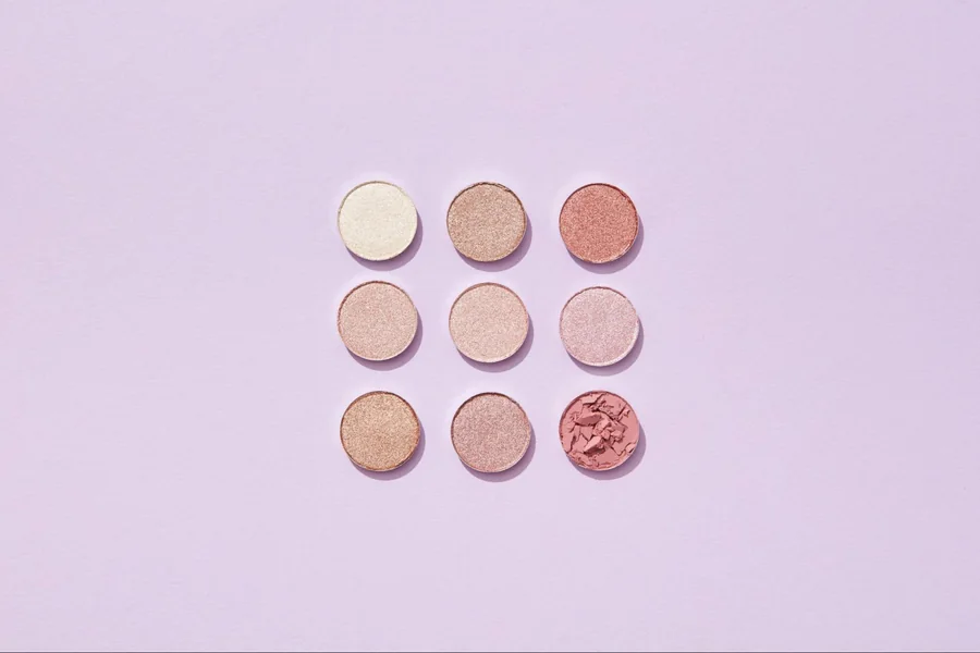
Place three skincare advertisements beside one another and the differences become obvious: one leads with the bottle, another with a discount, and a third with an elaborate background. Producing beauty product ads becomes more coherent when those choices follow a visual system. The goal is to make each creative communicate its particular message while still looking like part of the same brand.
That system does not need to be rigid. A launch, a product comparison, and a seasonal promotion have different jobs. Shared rules for typography, colour, product treatment, and information hierarchy give designers room to adapt the layout without rebuilding the brand from scratch.
Decide What the Viewer Should Notice First
Start with the primary message rather than the decoration. A new product launch may need the package and product name to dominate. A shade comparison may need several accurate swatches. A promotion may place the offer first while retaining enough product information to prevent ambiguity.
Write a simple priority order before designing. If the sequence is product, benefit, then action, the layout should support that order. When every element is equally large or bright, the viewer has to decide what matters.
Adobe’s hierarchy guidance explains how visual weight can be shaped through colour, type, size, and position. In a beauty campaign, use those controls to make the intended reading order visible rather than adding emphasis to every line.
A useful test is to view the design briefly at a reduced size. Identify what you noticed first and whether it matched the intended message. If the decorative flower attracts more attention than the product, adjust the composition before refining minor details.
Establish a Small Set of Brand Rules
Choose a restrained set of reusable decisions: headline type, supporting type, core colours, logo placement options, and preferred image treatment. Define the purpose of each choice so a new designer can apply it intelligently.
For example, a brand may use a quiet neutral background to make coloured packaging easier to recognise. That is more useful guidance than simply specifying beige everywhere. The principle can still work when a seasonal campaign requires a different background.
Keep rules for emphasis separate from rules for decoration. A strong offer colour should not also appear randomly in props and textures, or it loses its ability to direct attention.
Pixelixe’s guide to ecommerce ad banner design discusses the relationship between imagery, hierarchy, and calls to action. A beauty brand can use those same foundations while developing a distinct treatment for packaging, texture, and product families.
Protect Product Accuracy During Image Creation
Beauty packaging carries a large amount of identifying information. A changed cap, altered label, or incorrect shade can make an attractive advertisement inaccurate.
Use approved product photographs as the reference for the item being sold. If AI-generated backgrounds or decorative elements are introduced, inspect the product separately from the scene. Do not assume that a convincing overall image preserves small details.
Keep Labels and Packaging Legible
Check product names, volume markings, logos, and any visible claims against the real package. Generated text can look plausible at a glance while containing errors.
Where possible, keep the product photograph and typography as controlled design elements rather than asking a model to recreate them together. If a product cutout has a rough edge or an unnatural reflection, correct the asset before applying it across a template family.
Treat Colour as Product Information
Colour is particularly important for makeup, tinted skincare, and products sold in multiple packaging variants. Avoid applying a dramatic filter to the product itself merely to match the background.
Use approved imagery and compare the final creative with the source. Different screens can display colour differently, so do not promise that an on-screen shade is an exact representation under every viewing condition. The design goal is a faithful, consistent presentation using the best available reference.
Use Texture Without Turning It Into a Claim
Cream swirls, droplets, and botanical props can suggest a sensory experience. They can also imply ingredients, consistency, or performance that the product does not have.
Choose imagery that matches verified product characteristics. If a formula is a lightweight gel, a thick whipped texture may communicate the wrong expectation. A decorative ingredient should not imply that the product contains it unless that is accurate.
Keep aesthetic storytelling separate from evidence of results. A glowing backdrop can establish mood. Altered skin presented as an actual outcome makes a different claim and requires appropriate substantiation.
For a straightforward product advertisement, it is often more useful to show the package clearly and explain its intended place in a routine than to manufacture a dramatic transformation.
Build Templates Around Content Roles
A reusable template should define relationships between elements, not simply lock them into coordinates. Specify where the product sits, how long the headline can be, and what happens when supporting copy requires another line.
Create different template types for different jobs. A product spotlight, a shade comparison, and a bundle offer may share typography and colours while needing distinct layouts. Forcing all three into one template usually produces awkward compromises.
Before adopting a design, test it with difficult content. Try a long product name, a pale package, a wide jar, and a multi-item set. These cases reveal whether the system can handle the actual catalogue.
A practical template specification can include:
- The intended campaign purpose and reading order.
- Approved product-image proportions and clear-space requirements.
- Headline and supporting-copy length limits.
- Positions available for the logo and action text.
- Rules for optional prices, qualifiers, or promotional labels.
- The conditions that require a different layout.
These rules help non-designers make useful variations without treating the template as an empty space to fill.
Recompose for Each Format
Resizing a square ad into a tall frame is not always a simple scaling task. The relationship between the product, headline, and supporting elements changes when the available space changes.
Begin with the same message priority, then arrange the elements for the new format. A wide comparison may need a stacked layout. A tall bottle may work well in a vertical composition but require more careful spacing in a horizontal banner.
Check the creative at its likely display size. A product label that remains technically sharp may still be too small to read. If the label matters, enlarge the product or move the necessary information into readable supporting text.
Preserve breathing room. Filling every newly available area with badges or decorative objects often weakens the hierarchy. Empty space can help the product and message remain distinct.
Make a Product Family Feel Related
A campaign covering several products needs enough consistency to feel connected and enough variation to help viewers distinguish the items. Use stable typography and image treatment while assigning a controlled accent or layout cue to each category.
For a cleanser, moisturiser, and serum collection, the shared elements might include the background lighting and headline placement. Product-specific information should still be obvious: the name, format, and intended use cannot disappear into a uniform visual treatment.
Avoid relying on colour alone to separate variants. Add readable names or other clear identifiers so the distinction remains available when colours appear similar.
Review the family together before approving individual assets. A design that looks balanced on its own may become inconsistent beside the others because the product scale, margins, or logo treatment differ.
Test a Design Decision With a Clear Hypothesis
When reviewing campaign results, connect the next variation to a specific design question. You might ask whether a larger product image makes a bundle easier to understand or whether a shorter headline clarifies the offer.
Keep unrelated elements stable where practical. Changing the product, discount, background, and copy at once makes it difficult to learn which design choice mattered.
Use qualitative feedback as well as available performance data. Repeated questions about what is included may indicate a layout problem. Confusion between two shades may indicate insufficient labelling. Those observations can guide revisions even when campaign volumes are too small for strong statistical conclusions.
Record the reason behind a successful layout. “The product name remained readable on a phone” is a reusable design lesson. “This pink version won” is much less informative without the surrounding context.
Keep the Approved System Easy to Find
Store master templates, approved product imagery, and brand rules in a shared location with clear version names. Separate current assets from experiments and retired packaging.
When packaging changes, update the source assets and identify the templates that use them. A polished system loses value if it continues producing advertisements for an outdated bottle.
Assign someone to maintain the rules. A lightweight monthly review of new products, recurring layout problems, and outdated files can prevent a template library from becoming a collection of inconsistent exceptions.
Turn the Beauty Design System Into a Repeatable Pixelixe Workflow
The next step is to connect approved design decisions to the product catalogue. In Pixelixe, prepare reusable templates for the formats your team produces regularly: a single-product social card, an email promotion, and a collection banner. Keep the approved product photograph separate from the background, headline, price, and call to action so each element can be updated without recreating the entire composition.
Start with a small spreadsheet containing one row per planned creative. Useful fields include the product identifier, approved image reference, product name, shade, offer, language, and required template. Use the catalogue as the source for commercial information. AI can suggest a headline or background direction, but product facts and approved claims should remain controlled inputs.
Once the team has tested the layouts, an image generation API workflow can turn those structured inputs into repeated campaign assets. For example, a serum launch might need a feed image, a vertical story, and an email banner for each approved market. Map the same product record to a separate composition for each format, then review how the bottle, text, and offer appear at their intended display sizes.
Keep a record of the product image and template version used for each export. When a package, price, or approved claim changes, identify the affected creatives and regenerate those versions. Include a review step for shade names, label visibility, text overflow, and offer dates before publishing. This makes the visual system useful beyond one campaign: designers maintain the approved layouts while marketing teams produce consistent variations from current information.
Final Thoughts
A recognisable beauty campaign comes from deliberate relationships between product imagery, typography, colour, and message. Build templates around real content needs, protect the accuracy of the products, and adapt compositions to their viewing format. With those foundations in place, creative variation becomes easier to manage and each advertisement has a clearer role within the brand’s wider visual identity.