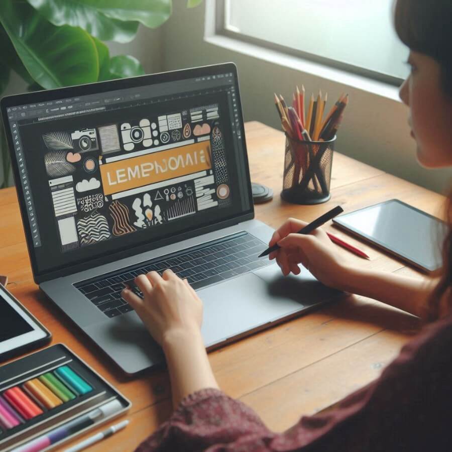
Image created with Microsoft Designer
Crafting an outstanding social media banner isn’t rocket science, but it does require some know-how. You want something that grabs attention fast and communicates clearly. Think of it as the storefront of your online presence.
Interested in what makes a great banner? Want to level up your brand’s visuals? Stay with me for practical tips and expert advice.
In this post we’ll cover it all from eye catching designs to brand consistency.
Balancing Text and Imagery for Maximum Impact
Text and imagery must work together on a social media banner. Think of your text as the main event and the images as supporting actors. You don’t want too much text clogging up your design; instead go for punchy and concise messaging.
Use bold fonts that stand out against your background without overwhelming it. Images should be high quality and relevant but not steal the show.
Also consider whitespace to give room to both elements.
Try out different layouts using Canva for Picsart free templates for banners. They have pre-designed options that can help you find the perfect balance quickly. Remember, clarity is key in visual communication!
Choosing the Right Dimensions for Various Platforms
Getting the dimensions right for each social media platform is important. Here’s a quick cheat sheet:
Facebook Cover Photo: 820 x 312 pixels
Twitter Header Image: 1500 x 500 pixels
LinkedIn Company Banner: 1536 x 768 pixels
Instagram Profile Banner (IGTV): 420 x 654 pixels
YouTube Channel Art: 2560 x 1440 pixels
Each platform has its own requirements. You’ll want to design for each one to make sure nothing important gets cut off or lost in translation.
Remember, higher res means better quality across all screen sizes. Always check the latest guidelines for each platform as they can change frequently.
Designing for Mobile vs Desktop Views
When designing social media banners you need to consider how they’ll look on both mobile and desktop screens. For mobile views, go simple and readable. Less screen means less detail.
Mobile: Use bigger fonts, fewer words and high contrast colors to be visible.
Desktop: You can get a bit more detailed with design elements since there’s more screen space.
Use responsive design tools like Figma or Adobe XD to design your banners. They let you see how your banner will look across different devices in real time.
A/B testing is your friend here! Try out multiple versions of your banner and test on different devices. Then you can analyze performance metrics like engagement rates to see which one works best.
Utilizing Dynamic Sizing in Responsive Design Tools
Dynamic sizing is key to designing social media banners. With different screen sizes, especially between mobile and desktop, your banner needs to scale smoothly.
From a technical point of view, dynamic sizing means using flexible units like percentages or ems instead of fixed pixels. This way text and images will scale proportionally based on the screen size.
Dynamic sizing improves user experience by maintaining aesthetics, regardless of the device used. It also helps avoid issues like overlapping elements or distorted images, ensuring clarity and professionalism across all platforms.
Exploring SVGs for Scalable, High-Quality Graphics
Choosing the right format for website graphics is crucial. JPG, PNG, and SVG each have their own strengths.
JPG: Best for photographs and complex images with many colors. They use lossy compression, which reduces file size but can degrade quality over time.
PNG: Ideal for images requiring transparency or simple graphics like logos. They offer lossless compression, maintaining quality at a higher file size compared to JPGs.
But SVG stands out in web design:
- SVG (Scalable Vector Graphics): Unlike raster formats (JPG/PNG), SVGs are vector-based. This means they’re composed of paths instead of pixels, making them infinitely scalable without losing clarity. Perfect for icons and detailed illustrations on responsive sites.
Moreover, SVG files are often smaller than high-resolution PNGs or JPGs. And they support animations and interactivity directly within your codebase. This gives you an edge in creating dynamic user experiences.
Final Thoughts on Elevating Your Social Media Presence
Creating an outstanding social media banner is only the first step to establishing a strong online presence for your brand. Building a community, engaging with your audience, and sharing insights and posts that people want to share - those are all important steps to take as well.
But an eye-catching social media banner will certainly help your efforts in those other areas, so don’t try to get by on the bare minimum! Consult with graphic designers, do A/B testing, and keep throwing things at the wall until something sticks!