In the ever-evolving world of marketing, the power of simplicity cannot be underestimated. Minimalist banners have emerged as a potent tool in marketing campaigns, offering a clean, impactful, and memorable way to communicate messages to the audience. In this article, we will explore the various aspects of minimalist banners and how they can be effectively used in marketing automation campaigns.
Understanding Minimalism in Design
Before diving into the applications of minimalist ad banners in marketing, it’s essential to grasp the concept of minimalism in design. Minimalism is characterized by simplicity, clarity, and a focus on essential elements. It eliminates unnecessary details, distractions, and embellishments, leaving behind a design that is both visually appealing and highly functional.
Minimalism in design is not a recent phenomenon; it has deep-rooted origins in various art movements, including the Bauhaus movement of the early 20th century. This design philosophy prioritizes functionality and form, often using minimal color palettes, simple shapes, and clean lines to convey a message or evoke emotions.
The Appeal of Minimalist Banners
Minimalist banners have gained popularity in marketing campaigns for several reasons:
1. Clarity of Message
One of the primary advantages of minimalist banners is their ability to convey a message clearly and concisely. With minimal distractions, the audience can quickly grasp the intended message without confusion.
Clarity in minimalist banners is achieved through a careful selection of elements. For example, if a company is promoting a new product, a minimalist banner may feature a high-resolution image of the product, accompanied by a brief, impactful slogan. This simplicity ensures that the audience focuses on the core message without being overwhelmed by unnecessary details.
2. Memorable Design
Simplicity often leads to memorability. Minimalist banners with a distinctive and straightforward design are more likely to leave a lasting impression on viewers.
To create a memorable minimalist banner, it’s important to consider the unique aspects of your brand or product. For instance, the Nike swoosh logo is an iconic example of minimalist design that has become instantly recognizable worldwide. Your minimalist banner should aim for a similar level of recognition, whether through a distinctive visual element, color scheme, or typography.
3. Versatility
Minimalist banners can be adapted to various platforms and purposes, from social media advertisements to website banners. Their versatility makes them suitable for a wide range of marketing campaigns.
When considering the versatility of minimalist banners, it’s crucial to think about how the same design can be adapted for different mediums. For instance, a minimalist banner used on Instagram may need to be square, while a website banner might have different dimensions. Maintaining the core design principles while making necessary adjustments ensures consistency across various marketing channels.
Tips for Creating Effective Minimalist Banners
Creating minimalist banners that resonate with your audience requires careful planning and execution. Here are some tips to help you craft effective minimalist banners:
1. Define Your Message
Before you start designing, clearly define the message you want to convey. Your minimalist banner should align with your marketing goals and the key message you want to communicate.
Defining your message involves understanding your target audience and their needs. Are you trying to inform, inspire, or persuade? By knowing your audience’s preferences and pain points, you can tailor your minimalist banner to speak directly to them.
2. Choose a Limited Color Palette
Minimalist banners often feature a limited color palette. Select colors that evoke the desired emotions and are consistent with your brand’s identity.
The choice of colors in a minimalist banner can have a profound impact on how the message is received. For example, calming pastel colors might be suitable for a wellness product, while bold and vibrant colors could work for a fashion brand. Consider the psychology of colors and how they align with your brand’s values when making color choices.
3. Use High-Quality Imagery
Even though minimalist design relies on simplicity, the quality of the imagery you use is crucial. High-resolution images ensure a professional look.
High-quality imagery is especially vital in minimalist banners, where every element is visible and serves a specific purpose. Invest in professional photography or use high-resolution stock images to ensure that your minimalist banner looks polished and appealing to your audience.
4. Focus on Typography
Typography plays a significant role in minimalist banners. Choose fonts that are easy to read and complement the overall design. Typography can also be a powerful way to emphasize key messages.
Typography in minimalist banners should strike a balance between being visually appealing and highly readable. Consider using bold fonts for headlines and legible, sans-serif fonts for body text. Experiment with font sizes, spacing, and hierarchy to guide the viewer’s attention to the most critical elements of your banner.
Real-World Examples
Let’s take a look at some real-world examples of minimalist banners used effectively in marketing campaigns:
Example 1: Apple
Apple is renowned for its minimalist approach to design. Their product banners often feature a clean, simple image of the product against a white background, accompanied by minimal text.

Apple’s minimalist banners exemplify the power of focusing on the product itself. By eliminating distractions and using a minimalist design, they let the product’s beauty and functionality shine. This approach has become synonymous with Apple’s brand identity, creating a strong association between simplicity and quality.
Example 2: Nike
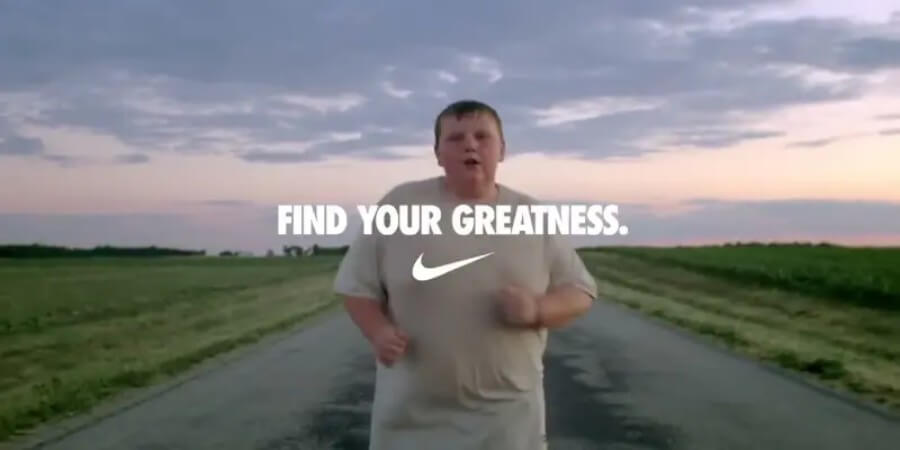
Nike’s minimalist banners often highlight a single product or athlete with a focus on the iconic swoosh logo. The simplicity of these banners conveys a sense of empowerment and athleticism.

Nike’s minimalist approach capitalizes on the brand’s core values: athleticism, determination, and achievement. By featuring a prominent swoosh logo and a single, powerful image, Nike’s banners evoke emotions of motivation and aspiration.
Conclusion
Minimalist banners have become a powerful tool in modern marketing campaigns. Their ability to convey messages clearly, create a lasting impact, and adapt to various platforms makes them a valuable asset for marketers. By following the tips and drawing inspiration from real-world examples, you can leverage the power of minimalist banners to enhance your marketing efforts.
Remember, less can often be more in the world of design, and minimalist banners exemplify this principle beautifully.
Happy designing!