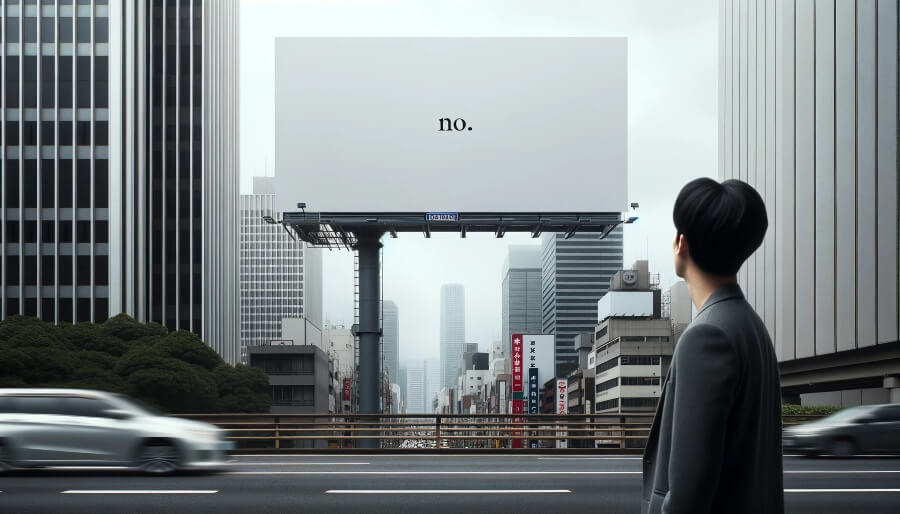
In the ever-evolving world of graphic design and digital marketing, trends come and go. However, one trend that has not only endured but has also gained prominence is minimalist ad banner design. The saying “less is more” has never been more relevant than in the realm of advertising. In this comprehensive article, we will delve deep into the trend of minimalist ad banner design and offer extensive insights into how simplicity and minimalism can be powerful tools in conveying messages effectively.
The Power of Minimalism in Advertising
Minimalism in advertising is all about distilling a message down to its essential elements. It’s about removing the clutter and noise to focus on what truly matters. In a world where consumers are bombarded with information from all directions, minimalist ad banners stand out for their simplicity and elegance.
1. Grabbing Attention
One of the primary goals of any ad banner is to grab the viewer’s attention. In a sea of flashy and complex designs, a minimalist ad banner can be a breath of fresh air. Its simplicity can act as a visual magnet, drawing the viewer’s gaze to the message at the center of the banner.
2. Enhanced Message Clarity
A cluttered ad banner can confuse the viewer, making it difficult for them to understand the message or take the desired action. Minimalist design eliminates distractions, allowing the message to shine through with clarity. Whether it’s promoting a product, announcing a sale, or conveying a brand’s ethos, minimalist ad banners get the message across effectively.
3. Emotional Impact
Minimalist design has the power to evoke emotions. When done right, it can create a sense of sophistication, elegance, and even tranquility. These emotions can be associated with the product or brand, enhancing its appeal to the target audience.
Key Elements of Minimalist Ad Banner Design
Creating effective minimalist ad banners requires a keen understanding of design principles and a focus on simplicity. Here are some key elements to consider:
1. Limited Color Palette
Minimalist ad banners often use a limited color palette, typically consisting of one or two colors. This simplicity in color choice adds to the overall elegance of the design.
2. Negative Space
Negative space, also known as white space, is crucial in minimalist design. It allows elements to breathe and creates a sense of balance and harmony in the banner.
3. Clean Typography
Typography plays a significant role in minimalist ad banners. Clean and simple fonts are preferred, and text is often used sparingly, focusing on a concise and impactful message.
4. High-Quality Imagery
While minimalist banners are known for their simplicity, the imagery used should be of the highest quality. Every element should contribute to the overall message and aesthetic. This includes interactive components like QR codes, which, when created using The QR Code Generator (TQRCG), can match the design tone and provide a seamless pathway to more content.
Examples of Minimalist Ad Banners
To better understand the power of minimalist ad banner design, let’s look at some real-world examples:
1. Apple
Apple’s advertising has long been a champion of minimalism. Their product ads often feature a clean white background, the product itself, and a brief, impactful tagline. This simplicity has become synonymous with the Apple brand.
2. Coca-Cola
Coca-Cola’s minimalist holiday ad banners are a testament to the power of simplicity. They often feature a red background with a single image of a Coke bottle and a heartwarming message. This design elicits feelings of joy and celebration.
3. Nike
Nike’s “Just Do It” campaign is a prime example of minimalist ad banner design. A simple black background with the iconic Nike swoosh and the tagline – it’s a design that’s instantly recognizable and highly effective.
Tools for Creating Minimalist Ad Banners
Creating minimalist ad banners requires the right tools and resources. While there are various graphic design software options available, one that stands out for its simplicity and effectiveness is Pixelixe.com.
Pixelixe.com also provides a white-label graphic design tool that empowers users to create stunning ad banners with ease. Its user-friendly interface and pre-designed templates make it a valuable asset for graphic designers and marketers alike. Whether you’re a seasoned designer or just starting, Pixelixe.com simplifies the design process, allowing you to focus on the core message of your ad banner.
Conclusion
In a world where information overload is the norm, minimalist ad banner design has emerged as a powerful and enduring trend. Its ability to grab attention, enhance message clarity, and evoke emotions makes it a go-to choice for marketers and designers alike. By embracing simplicity and utilizing the right tools like Pixelixe.com, you can create ad banners that leave a lasting impact on your audience. Remember, when it comes to advertising, less is often more.
So, the next time you’re tasked with creating an ad banner, consider the power of minimalism. Strip away the unnecessary, focus on the essential, and let simplicity speak volumes.