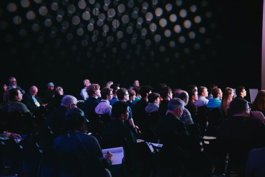
Event promotion in the digital era is a dynamic and visual endeavor. The right graphics not only catch the eye but also communicate the essential details and spirit of your event, compelling your audience towards action. Mastering your event promotion graphics is an art that involves understanding your audience, defining a visual identity, and using design tools effectively. Below, we delve deeper into these aspects to help you craft impactful event graphics.
Understanding Your Audience
Knowing your target audience is the cornerstone of effective event promotion. Demographics such as age, interests, profession, and digital habits play a crucial role in shaping your design strategy. For instance, vibrant and bold colors may attract a younger crowd, while a more subdued palette might appeal to a professional audience. Platforms like Instagram cater to visually driven content, perfect for engaging younger demographics, whereas LinkedIn is ideal for reaching professionals with a more formal tone.
- Research Your Audience: Use surveys, social media analytics, and event feedback to gather information about your audience’s preferences and behaviors.
- Personas: Create audience personas to represent the typical attendees of your event. This will help you visualize and tailor your graphic designs to the people you want to attract.
Defining Your Event’s Visual Identity
Your event’s visual identity should resonate with its theme and your brand’s overall image. It’s about finding a unique voice and visual style that sets your event apart.
- Logo and Color Scheme: Your event logo and color scheme are pivotal. These should align with the theme of your event while also standing out on various platforms. Consider colors that evoke the desired emotions and attitudes related to your event.
- Typography: Choose fonts that are not only in harmony with your event’s character but are also legible across devices and sizes. A mix of two or three fonts at most can maintain visual interest without overwhelming your audience.
- Imagery and Icons: Use images, illustrations, and icons that reflect the essence of your event. Authentic photos from past events can create a sense of anticipation and authenticity.
Leveraging Design Tools and Templates
With the plethora of design tools available, creating professional-quality graphic designs has never been more accessible. Tools like Pixelixe.com offer intuitive design platforms equipped with templates tailored for event promotion.
- Templates: Start with a template that closely matches your vision and customize it to fit your event’s identity. This approach saves time and ensures consistency across your promotional materials.
- Branding Elements: Most design tools allow you to upload your branding elements, ensuring that every piece of content you create is aligned with your event’s visual identity.
- Collaboration: Utilize platforms that enable team collaboration, allowing for feedback and contributions from different members of your event planning team.
Crafting a Compelling Visual Narrative
Your promotion graphics should weave a visual story that guides potential attendees through the journey of your event, from anticipation to participation.
- Sequential Content: Design a series of graphics that build upon each other, maintaining a narrative flow. This could start with a ‘save the date,’ followed by speaker announcements, and leading up to last-minute reminders.
- Emotional Engagement: Use visuals that evoke the emotions you want your audience to feel. Whether it’s excitement, curiosity, or inspiration, your graphics should mirror the experience of attending your event.
Optimization for Different Platforms
Each social media platform has its own set of rules and best practices for images. Tailoring your graphics to each platform ensures they perform well and reach your intended audience effectively.
- Format and Size: Adhere to the recommended image sizes and formats for each platform to ensure your graphics look their best.
- Platform-Specific Features: Take advantage of platform-specific features, like Instagram Stories or Twitter Cards, to increase visibility and engagement.
Incorporating Clear Calls to Action
Your graphics should not only inform but also inspire action. Whether it’s registering for the event, learning more about it, or following your social media channels, clear CTAs are essential.
- Visibility: Make sure your CTA stands out by using contrasting colors or design elements.
- Simplicity: Keep your CTA simple and straightforward. Complicated messages can deter potential attendees from taking action.
A/B Testing Your Graphics
A/B testing graphics, or split testing, is a method of comparing two versions of a graphic to see which one performs better. This approach is invaluable in fine-tuning your event promotion strategy.
- Variables: Test different elements, such as color schemes, imagery, or CTAs, to see what resonates with your audience.
- Metrics: Focus on key metrics like click-through rates and engagement levels to measure success.
Tracking and Analyzing Performance
Utilizing analytics tools to track the performance of your promotion graphics can offer insights into what’s working and what’s not, allowing you to adjust your strategy accordingly.
- Engagement Metrics: Look at likes, shares, comments, and other forms of engagement to understand how your graphics are resonating with your audience.
- Conversion Rates: Track how many viewers are taking the desired action, such as registering for the event, to gauge the effectiveness of your CTAs.
By expanding each section with detailed strategies and actionable tips, this comprehensive guide aims to empower event organizers with the knowledge to create captivating and effective event promotion graphics. Remember, the goal is not just to inform but to inspire and engage your audience, driving them to action and ensuring the success of your event.