E-commerce banners should do more than fill space. The strongest ones help shoppers understand the offer, spot the right product, and move to the next click with less hesitation.
That is why high-converting banners are usually simple, specific, and tied to a clear decision stage. Whether you are promoting a sale, pushing a category, or launching a seasonal campaign, the banner has to make the next click feel obvious fast.
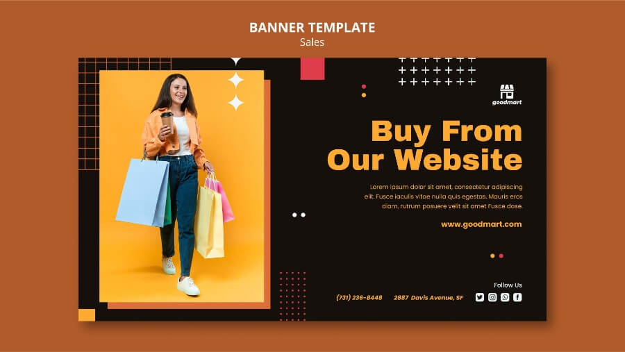
If you are working on a broader merchandising system, it also helps to compare this guide with eye-catching ecommerce banner design, high-converting ecommerce banner examples, and banner creation workflows for ecommerce. This article focuses on conversion strategy and campaign behavior; for layout, merchandising composition, and banner build choices, see Designing Eye-Catching E-commerce Banners.
What conversion-focused ecommerce banners actually do
A useful ecommerce banner usually handles one of these jobs:
- introduce a promotion without confusing the offer
- push shoppers toward a category or collection page
- feature a hero product with a clear next action
- support seasonal merchandising without breaking brand consistency
- help returning visitors spot what changed since their last visit
When a banner tries to do too many of those jobs at once, it usually underperforms.
Conversion patterns that work in practice
1. Promo hierarchy first
If the banner is promoting a discount, the offer has to win the visual hierarchy immediately. Lead with the main value point, then support it with a short qualifier.
A simple order usually works best:
- Main offer
- Eligible product or category
- Time sensitivity or condition
- CTA
Example:
Up to 30% offSelected home office chairsThis week onlyShop the sale
That structure is easier to scan than a banner that starts with brand copy and hides the actual promotion in smaller text.
2. Use urgency carefully
Urgency helps when it removes indecision, not when it feels noisy. Short phrases such as Ends Sunday, Limited drop, or Last chance on winter styles can work well when the rest of the layout stays clean.
Avoid stacking too many urgency cues in one banner. If everything is flashing, nothing feels important.
3. Build category banners for browsing, not just branding
Category banners perform best when they help shoppers orient themselves quickly. A good category banner should make three things obvious:
- what kind of products live here
- who the collection is for
- why it is worth exploring now
That is why category banners often work better with a clear product range name plus a quick value cue such as new arrivals, best sellers, or starter bundles.
4. Treat seasonal offers like merchandising campaigns
Seasonal banners should feel specific to the moment without looking disposable. The strongest approach is usually to keep the template structure stable and swap the campaign layer:
- seasonal headline
- relevant product image
- updated accent color or motif
- current CTA
That way the banner still feels on-brand while giving the campaign a fresh reason to exist.
5. Make product-led banners point to one next step
If the banner is product-led, the product still needs to serve a conversion job. The shopper should know whether the click leads to a product page, a collection page, or a promotion landing page.
A product-led banner usually works best when:
- the product is clearly tied to the offer
- the CTA explains the next step
- the landing page matches what the banner promises
- trust or shipping cues support the decision without distracting from it
Where automation helps ecommerce teams scale banners
Manual banner production breaks down quickly once your team needs weekly updates, multiple formats, and repeated offer changes.
Automation becomes especially useful when you need to:
- swap prices, offers, or collection names across many banners
- create the same campaign in several sizes
- localize copy for different markets or audience segments
- refresh category banners from a product feed or promotion calendar
- keep brand rules consistent across repeated launches
If your team is producing banners every week, explore how image automation improves ecommerce workflows and how teams automate banner generation for ecommerce.
Ecommerce banner performance checklist
Use this quick review before publishing:
- Is the main offer readable in one glance?
- Does the banner lead with one clear objective?
- Is the CTA obvious without overpowering the message?
- Does the product or category appear immediately relevant?
- Is the layout still clear on smaller screens?
- Is the banner visually consistent with the rest of the campaign?
- Can the same template be reused for future variants?
If you answer no to more than one of those, the banner probably needs another pass.
Final take
The best ecommerce banners are usually the easiest to understand. They give the offer a clear hierarchy, keep the product or category in focus, and make the next action feel obvious.
If your team runs recurring promo cycles, a template-based workflow in Pixelixe can cut down the repeated banner work while keeping those campaign rules more consistent.