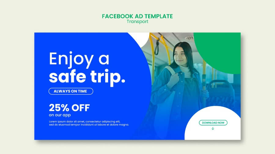
Designing Effective Call-to-Action Banners with Graphic Design - A How-To Guide

In today’s digital age, designing an effective call-to-action (CTA) banner is crucial for capturing audience attention and driving engagement. A well-crafted CTA banner can be the difference between a user taking the desired action or scrolling past. This comprehensive guide will explore the intricacies of designing compelling CTA banners using fundamental and advanced graphic design principles.

Understanding Call-to-Action Banners

CTA banners are pivotal in guiding users towards taking a specific action, such as subscribing to a newsletter, purchasing a product, or downloading a whitepaper. These banners must be visually appealing and convey a message that resonates with the audience, encouraging immediate action. The design of a CTA banner involves a harmonious blend of color, typography, imagery, and copy to create a focal point that captures user interest and compels action.

The Importance of Clarity and Simplicity

The primary goal of a CTA banner is to communicate a specific action clearly and concisely. A cluttered or confusing banner can deter users from engaging further. Achieving clarity and simplicity in design does not mean the message must be dull. Instead, it challenges designers to distill their message to its essence, using minimal elements to convey a powerful and actionable message. Check out our minimalist ad banners article right here.

Expanding on Clarity and Simplicity:

  • Visual Hierarchy: Establish a clear visual hierarchy that guides the viewer’s eye to the most critical part of the banner—the call to action. Use size, color, and spatial relationships to differentiate and prioritize elements.
  • Whitespace: Leveraging whitespace around your CTA can help it stand out. This doesn’t necessarily mean the space must be white; it refers to any unoccupied space that prevents the design from feeling overcrowded.
  • Simplifying the Message: Each word on your CTA banner competes for the viewer’s attention. Keep the copy as brief as possible, removing any unnecessary words or details that don’t contribute to the banner’s goal.

Leveraging Color Psychology

Color is a powerful tool in the designer’s arsenal, capable of evoking emotions and influencing decisions. The choice of color in a CTA banner can affect its visibility and the user’s reaction. Understanding color psychology and its impact on user behavior is essential for creating effective CTA banners.

Delving Deeper into Color Psychology:

  • Cultural Contexts: Be mindful of the cultural contexts of your target audience, as color meanings can vary significantly across different cultures.
  • Brand Alignment: The colors used in your CTA banner should align with your brand’s color scheme to maintain consistency and brand recognition.
  • Accessibility: Consider color contrast and accessibility. Users with visual impairments must be able to distinguish the CTA from the banner background.

Typography Matters

Typography in CTA banners does more than convey a message; it also plays a significant role in the overall aesthetics and effectiveness of the design. The right choice of font and type settings can grab attention, establish mood, and ensure readability.

Expanding on Typography:

  • Font Pairing: Combining fonts can add interest and hierarchy to your design. However, it’s important to pair fonts with contrasting characteristics carefully—such as a serif with a sans-serif—to maintain readability.
  • Responsive Typography: With the prevalence of mobile devices, ensuring your typography scales well across different screen sizes is crucial for maintaining the effectiveness of your CTA banner.
  • Emotional Impact: Different fonts can evoke different feelings and associations. For example, a bold, blocky font might convey strength and urgency, while a script font might suggest elegance or whimsy.

Crafting Compelling Copy

The text on your CTA banner is the direct communication link between you and your audience. Crafting compelling copy requires understanding your audience’s needs and motivations and presenting your offer in a way that resonates with them.

Strategies for Enhancing Copy:

  • Benefit-Oriented Language: Focus on what the user will gain by clicking the CTA. Highlighting benefits rather than features can make the offer more appealing.
  • Personalization: Use language that speaks directly to the user, making the message feel more personal and targeted. Words like “You” and “Your” can create a sense of connection and relevance.
  • Clarity and Urgency: Beyond being clear and concise, your copy should also convey a sense of urgency. This can be achieved through limited-time offers, exclusivity, or language that prompts immediate action.

Strategic Placement and Size

The effectiveness of a CTA banner is not only determined by its design but also by where it is placed on the page. Strategic placement ensures that the banner captures attention without disrupting the user experience.

Considerations for Placement and Size:

  • User Flow: Understand the typical user flow on your page to place your CTA banner in a location that naturally attracts the user’s attention. Common areas include the top of the page, within the main content, or at the end of content as a next step.
  • Balance and Proportion: The size of the CTA banner should be balanced with the overall page layout. A too-large banner can be overwhelming, while a too-small banner may go unnoticed.
  • Mobile Optimization: Given the significant amount of web traffic from mobile devices, ensure your CTA banner is optimized for mobile viewing, both in terms of size and placement.

The Role of Imagery

Imagery in CTA banners can significantly enhance the message and appeal of the call to action. The right image can attract attention, evoke emotion, and support the message you want to convey.

Effective Use of Imagery:

  • Consistency with Message: The imagery should be directly related to the message and action of the CTA. For instance, if the CTA is about downloading a free guide, an image of the guide or a related thematic element can reinforce the message.
  • Emotional Appeal: Images have the power to evoke emotions. Choosing an image that aligns with the emotional tone of your message can enhance the effectiveness of your CTA.
  • Quality and Relevance: High-quality, relevant images can increase the perceived value of what you’re offering and encourage users to take action. Avoid generic stock photos that don’t add value to your message.

A/B Testing: The Path to Optimization

The design of CTA banners is not a one-size-fits-all solution. What works for one audience or campaign might not work for another. A/B testing, the process of comparing two versions of a banner to see which one performs better, is essential for optimizing your CTA banners.

Deep Dive into A/B Testing:

  • Variable Isolation: When conducting A/B testing, change only one element at a time (e.g., the CTA text, color, or placement) to accurately measure its impact.
  • Long-Term Testing: Consumer behaviors and preferences can change over time. Regularly testing and updating your CTA banners can help maintain their effectiveness.
  • Quantitative and Qualitative Data: While A/B testing often focuses on quantitative data like click-through rates, don’t overlook qualitative feedback. User comments and usability testing can provide insights into why one version performs better than another.

Conclusion

Designing effective call-to-action banners is a nuanced process that requires a deep understanding of graphic design principles, audience psychology, and strategic testing. By prioritizing clarity, leveraging design elements like color and typography wisely, and continuously optimizing through A/B testing, you can create CTA banners that not only look appealing but also drive conversions. Remember, the ultimate goal is to communicate value and encourage action, making your CTA banners a critical component of your digital marketing strategy.


Follow the Journey


Subscribe to our monthly newsletter to get updates about the Pixelixe platform
and our marketing discoveries, subscribe below to receive it!