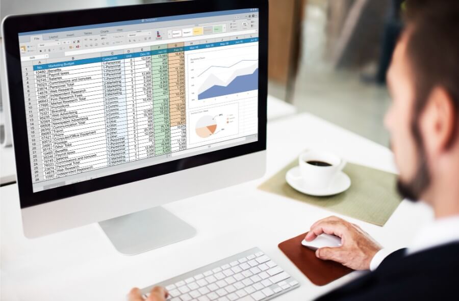
Ever felt like showing data in a visual format but got stuck because the process seemed too complex? You’re not alone. Many people have useful data in spreadsheets but don’t know how to turn that into easy-to-understand visuals. Whether it’s for a presentation, report, personal tracking, or financial planning, graphics make information more digestible and even more interesting.
And the best part is you don’t need any advanced tools or coding skills to get started. With just a basic spreadsheet and some smart use of tools, you can build clear and useful data-driven graphics.
Why Visuals Make a Big Difference
Plain numbers in rows and columns can get boring or even confusing. But when you show the same numbers in a chart or graphic, it becomes much easier to understand.
For example, showing a pie chart of expenses gives a clear picture of where the money is going. A line chart of monthly income trends immediately shows if things are improving or not. That’s the power of visuals, they help people grasp the message without having to read every single number.
Even something as simple as a bar chart can show trends, comparisons, or totals far better than a list of numbers. It gives you a quick summary at a glance and saves a lot of time for the viewer.
Start with a Clean Spreadsheet
Before building any graphic, your spreadsheet should be clean and organized. Make sure your headings are correct, and every column has only one type of data.
For instance, don’t mix income and expenses in one column. Use separate columns for categories like date, amount, type of expense, or income source. Also, keep the data consistent.
If one cell says “Grocery” and another says “groceries,” the tool might get confused and treat them as separate items. These small things help any graphic design tool understand the data better and build accurate visuals without confusion. Clean data is always the first step toward a strong graphic.
Pick the Right Tool for the Job
Many simple tools let you create data-driven graphics directly from your spreadsheet. If you’re using Google Sheets, you can create charts directly within the platform using the built-in chart editor.
You just select your data, click on “Insert chart,” and then choose the chart type you want. Microsoft Excel works similarly. You can also use online tools like Canva, Flourish, or Datawrapper if you want more design control. These tools often allow you to upload a CSV or connect a live spreadsheet.
For those who want automatic updates, linking tools like Google Data Studio or even Power BI for more advanced work can be useful. But for basic daily needs, the built-in options in spreadsheets are more than enough.
Choose the Best Graphic for Your Data
Different types of charts work better for different kinds of data. If you’re showing changes over time, use a line chart. If you’re comparing categories, bar charts work well.
For part-to-whole visuals, like how a budget is split across categories, pie charts are the best. Don’t use a fancy type of chart just because it looks different pick the one that explains your data clearly.
Simple visuals are often the most powerful. Also, avoid stuffing too much into one chart. If you have more than five categories or too many data points, consider splitting them across two charts to make it easier to follow.
Automate Graphics with Live Spreadsheet Links
Some tools allow you to link your spreadsheet directly to the graphic. That means every time you update the sheet, the graphic also updates automatically. This is useful when your data changes often, like sales numbers, monthly reports, or budgeting charts.
Instead of making a new chart every time, you just update your spreadsheet, and everything else stays in sync. It saves time and keeps everything current. For businesses or even personal finance tracking, this is a time-saver and helps maintain accuracy.
Real Life Example: Showing Debt Breakdown
Imagine someone is managing multiple loans: a personal loan, a credit card, and a payday loan. In a spreadsheet, each type of debt is listed with the amount, interest rate, and due date.
Now, if this person wants to show how much each loan contributes to the total, a simple pie chart from that spreadsheet makes it easy to see. It also helps them plan repayment better.
If they decide to go for debt consolidation, this kind of graphic clearly shows why combining everything into one payment makes sense. They can also use bar charts to show how each loan balance reduces over time and line charts to track their overall progress month by month. To streamline this entire process even further, a loan management system workflow helps organize data, automate tracking, and provide clearer insights into repayment progress.
Visuals Help in Decision Making
Whether you’re managing personal finances or making business presentations, visuals help you make better decisions. For example, if your spreadsheet shows your monthly expenses, a line chart will show if your spending is going up or down.
If you’re trying to reduce debt and track progress, a bar chart can show how much each debt has reduced every month. These visuals are not just for show, they help you stay on track and adjust your plan if needed.
When it comes to finance, clear data visuals help reduce confusion and show where action is needed. In families, they help everyone stay on the same page, especially when managing shared money.
Combine Charts with Simple Labels
A good chart is not just about colours and shapes. It should also have clear labels, legends, and titles. People should understand what the chart is showing without having to guess. Use simple terms like “Monthly Income Trend” or “Debt Distribution by Category.”
Also, make sure the numbers are easy to read and the fonts are not too small. These small details make your charts much more helpful. A good rule is that if someone can understand the chart in 5 seconds, you’ve done it right.
Keep It Simple and Clean
Sometimes, people try to add too much data into one chart. This makes it messy and hard to read. It’s better to break the data into two or three smaller charts than to overload one graphic. Focus on one message per chart.
If you’re showing debt types, just show that. If you want to show repayment progress, use a separate chart. Simple visuals are easier to understand and help the person looking at them. Also, avoid using too many colours; stick to 3 to 5 basic shades to keep the chart neat.
For Reporting, Add Summary Text Below the Charts
If you’re using the visuals in a report or presentation, always add a few lines of text below the graphic. This explains what the chart shows and what action should be taken based on the information.
For example, after a debt chart, you can add a line like, “This chart shows that 60% of debt comes from credit cards. A better repayment focus should be placed here.” This helps the person viewing it take better action. It also adds clarity if the graphic is shared without verbal explanation.
When Consumer Proposal Visuals Come in Handy
Suppose someone is trying to decide between different ways to manage their debt. Their spreadsheet shows income, total debt, and available monthly budget. By using this data to create a bar chart comparing repayment plans, they can see what fits their pocket.
If their income is tight, a consumer proposal canada might show up as the most manageable option in the chart. These visuals help explain the plan not only to them but also to anyone else involved in the decision, like family members or advisors. It’s a simple way to show complex information clearly.
Using Visuals for Planning and Tracking
Once you’ve created your graphics, don’t just use them once and forget. Keep updating the spreadsheet every month and reviewing the charts. Use them to track progress, find problems early, and make better choices.
Whether it’s saving more, spending less, or paying off loans, these visuals help you stay focused. They act like a mirror, showing what’s working and what needs attention. Over time, these small updates help you see real progress, and that builds confidence to keep going.
Easy Sharing and Collaboration
Most tools allow you to share your chart or graphic with others through a link or by exporting it as an image or PDF. If you’re working in a team or sharing progress with family, these visuals help everyone stay informed.
You don’t need to explain everything from scratch every time, just update the chart and let it do the talking. This is also useful if you’re planning a financial strategy with someone or discussing options like debt relief. Simple visuals can help avoid confusion and make teamwork more effective.
Final Checks Before You Share
Before sharing your data-driven graphics, check a few things. Make sure the data is updated and accurate. Remove any spelling mistakes in the labels. Check that the chart size is readable on both desktop and mobile. If you’re embedding the graphic in a document or presentation, ensure the resolution is good enough to stay clear when zoomed in.
These last checks help maintain clarity and make a better impression. If you’re presenting it to others, even small details like alignment and spacing can make your charts look more professional.
Conclusion
Building data-driven graphics from spreadsheets doesn’t have to be complicated. With a little practice and the right tools, anyone can do it. Start with clean data, pick the right chart type, and keep your visuals clear and simple. Whether you’re showing debt details, monthly savings, or spending patterns, these graphics help turn plain numbers into powerful information. And once everything is set, they make planning and decision-making feel less stressful and more confident.