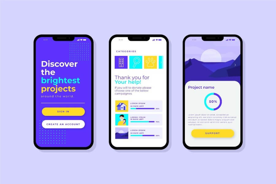
Disappointed by websites or apps that look awkward on your phone? Imagine squinting to read text or struggling with unresponsive buttons. Responsive design solves this problem and more.
It ensures websites automatically adjust to any screen size, offering a smooth user experience on desktops, tablets, and phones. Mastering responsive design lets you conquer website woes and create an enjoyable journey for all your visitors.
How Design Principles Evolved
The Print Design Era
During the print heyday, designers used a set of tools to catch people’s attention and to make the information being conveyed easy to understand. They primarily used these tools to develop their creations:
Visual flow (to guide people to follow a “path” through the design)
Balance (to make the design even)
Hierarchy (to organize things in order of importance).
Designers during that time focused mainly on two things: to create layouts that were easy on the eyes and to make useful artwork. They are known to employ grids to put a page’s elements in order. They also used various fonts to make important elements distinct, including special color schemes to achieve beauty and make the text easy to read.
The Birth of Digital Design
The emergence of digital media prompted designers to evolve. From working by the design principles of a page, they must adapt to rules that govern how users interact with screens. This shift gave birth to user interface (UI) design. Unlike in the previous era, UI design is all about creating interfaces that are user-friendly and interactive.
The digital era also made user experience (UX) design more important than ever. In essence, UX demands software applications and websites to be easy to use, engaging, and accessible. As such, today’s designers are tasked to create designs that allow users to easily use and deal with content.
Responsive Design Takes Center Stage
It was in late 2016 when the desktop was first surpassed by mobile when it came to internet usage worldwide. Suddenly, the digital world needed a layout scheme that could make mobile internet use effortless, efficient, and enjoyable.
This major event gave birth to responsive design. Whether on smartphones, tablets, or desktops, responsive design facilitates favorable, consistent UX.
Designers are compelled to adapt to the shifting mobile user preferences primarily due to the fact that most people—around 60% of the global internet traffic—are now accessing the internet using their mobile devices.
This is among the reasons why responsive design is now a standard in web and app development. For more insights, do not hesitate to contact the web app development company of your choice. Most of them are specialized in responsive design solutions.
Mastering Design for Different Screens
Responsive or Adaptive Design
Nowadays, designers usually select between two methods when creating websites for any screen size—responsive design and adaptive design.
Responsive design uses layouts that adjust to different screen sizes. It guarantees a similar UX to any device by leveraging media queries and flexible grids. This method that responsive design uses is particularly efficient for sustaining accessibility and consistency, which are key factors that are known to increase user satisfaction and engagement.
Research suggests that most organizations that use responsive design experience high conversion and sales.
Adaptive design, on the other hand, pertains to creating different layouts for diverse screen sizes. This strategy supports better personalization, which maximizes usability and performance for every device. This approach is especially helpful for projects that necessitates increased optimization for particular types of devices.
Organizing Content for Various Viewports
Prioritize content according to the size of the viewport when designing for various screen sizes.
Design from smaller screens first, then to bigger ones using the progressive disclosure method. This approach helps identify which new information can be added as the screen gets bigger.
Start by displaying the most important information on smaller screens. Add more information as the screen size increases/space allows.
For instance, a blog post’s mobile version might show the headline and summary. Its desktop version, on the other hand, shows the entire text, including images, videos, and links. Given that 75% of users go for mobile-friendly blogs, zeroing in on mobile design is critical.
Technical Aspects
Various technical elements come into play when designing for several platforms and devices.
To ensure that graphics and images look clear and load fast, you must optimize them for various resolutions. You can use methods like vector graphics and responsive images for this purpose.
Choose fonts that look clean in any screen size. Properly employ white spaces to help you develop a visual hierarchy. These methods also help make the design more attractive and user-friendly.

Designing for Particular Screen Sizes
Mobile-First Design
You can have peace of mind that your apps and websites will work well on any screen if you start designing them with mobile in mind. A mobile-first design centers on streamlining navigation and layouts, clear calls to action, and touch-friendly gestures.
This approach aims to make interactions seamless, which is why content is designed for easy reading, menus effortlessly accessible, and buttons are bigger.
Desktop Design
Creating designs for larger screens like desktops and laptops gives bigger legroom for designers to work. To assist users easily navigate the site or app, designers organize content and other page elements using structured layouts and grids.
Designers can make a page attractive without complicating the primary layout by integrating interactive elements like animations and hover states.
These design features make the site more dynamic and enhance overall UX.
Tablets Mid-sized Design
At the middle ground of mobiles and desktops is the layout for tablet devices like iPads and Android tablets. Designers create tablet designs by balancing between desktop and mobile phone standards.
Since they provide more space compared to mobile phones, table layouts should maintain their clean, clutter-free designs and have more responsive touch controls.
The Future of Design
As technologies continue to evolve in this fast-paced world, screen design requirements will also change. Thus, the need to ensure seamless user experience across devices will persist.
Designers must come up with design layouts and elements that address the needs of new and unfamiliar technologies such as wearables like smartwatches. By remaining innovative and flexible, designers can create user interfaces that support high-quality and consistent UX in any device or platform.

Design Tools and Strategies
Responsive Design Principles
Using Foundation, Skeleton, Bootstrap, Montage, and other popular responsive design frameworks can significantly streamline layout creation that looks good on any type of device. These tools come with pre-designed components like forms, navigation bars, and buttons.
They also provide that trusty grid feature to effortlessly organize content neatly on smartphones, tablets, and desktops.
These frameworks allow designers to quickly create engaging, consistent, and responsive apps and websites. This helps save time and resources and guarantees consistency across all software and website development projects.
A/B Testing across Various Platforms and Devices
To optimize designs across different devices, A/B testing is necessary. This involves comparing multiple design versions to identify the most optimal one.
Testing various types of navigation, text, and layouts allows designers to gather data on how users find the various elements in the design. This can also shed light on what users prefer and whether they find it difficult or easy to navigate the website or app.
Let’s suppose an online university will be disseminating information about degrees that make the most money, as part of its major ad campaign. Before launching the campaign, it wants to test a detailed desktop layout with complete descriptions and navigation and a basic mobile version with minimal information and simple links.
Analyzing the test results will help the university which graphic design for education elements work best for various devices. Aside from helping achieve success, the insights derived from the tests will help ensure a good user experience on any device prospective students may use.
Inclusion and Accessibility Aspects
Creating accessibility and inclusion designs involves producing digital layouts everyone—with or without disabilities—can use an app or website.
Website or app designs that ensure accessibility and inclusion involves the following:
Allowing keyboard navigation
Make the layout screen reader-friendly
Utilize semantic HTML to provide meaningful content
Optimize font sizes and color contrast to assist visually challenged users.
Wrapping Up
Responsive design is a vital element that organizations must leverage to provide excellent user experiences and reach a broader audience.
As more and more people use mobile devices to access the internet, designers must give priority to adaptability to guarantee their designs run smoothly across all screens and devices.
The future of web and app design rests on championing adaptability and staying ahead of technological developments. Continually reshaping design techniques and principles empowers designers to create innovative and engaging user experiences and high productivity on any device.