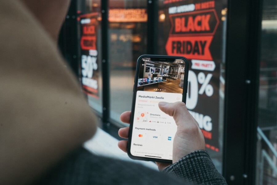
In the world of e-commerce, first impressions matter. When a potential customer visits your online store, the first visual elements they encounter are your banners. These eye-catching graphics play a crucial role in capturing attention, conveying your brand’s message, and ultimately driving sales. In this comprehensive guide, we’ll explore the art and science of designing e-commerce banners, offering valuable tips and insights into the latest design trends.
Introduction
Imagine a shopper navigating the crowded streets of a bustling city, glancing at store windows adorned with vibrant displays. Those displays are the real-world equivalent of e-commerce banners, beckoning customers to step inside and explore. In the digital realm, your e-commerce banners serve a similar purpose—they are the virtual storefront displays that entice visitors to browse your products, click through to your offerings, and make a purchase.
Designing effective e-commerce banners is both an art and a science. It requires a deep understanding of your target audience, an eye for aesthetics, and knowledge of the latest design trends. In this guide, we will delve into the intricacies of e-commerce banner design, providing you with the tools and insights needed to create banners that not only catch the eye but also drive conversions.
The Importance of E-commerce Banners
Before we dive into the nitty-gritty of banner design, let’s underscore the significance of e-commerce banners in the digital shopping experience. E-commerce banners serve several critical functions:
Capturing Attention: In the crowded online marketplace, attention spans are short. Banners are often the first things visitors notice, so they must grab attention immediately.
Conveying Brand Identity: Banners convey your brand’s personality, values, and unique selling points. They help establish brand recognition and trust.
Promoting Products and Offers: Banners are powerful tools for promoting specific products, sales, discounts, and promotions. They can drive visitors to featured product pages.
Providing Navigation: Banners can serve as navigation aids, directing visitors to different sections of your store, such as product categories, new arrivals, or clearance items.
Enhancing User Experience: Well-designed banners improve the overall user experience by making it easy for visitors to find what they’re looking for.
With these roles in mind, let’s explore how to design e-commerce banners that effectively fulfill these functions and more.
Understanding Your Target Audience
The foundation of successful banner design lies in a deep understanding of your target audience. Your banners should resonate with your ideal customers, addressing their needs, preferences, and pain points. Here’s how to get inside the minds of your audience:
Buyer Personas: Create detailed buyer personas that represent your typical customers. Understand their demographics, behaviors, motivations, and goals.
Market Research: Conduct market research to identify trends, preferences, and pain points within your niche. What are your competitors doing with their banners?
User Analytics: Analyze user data from your website or e-commerce platform. What pages do visitors frequent? What products do they view? This data can inform banner content.
Feedback and Surveys: Collect feedback from existing customers through surveys, reviews, and social media. Ask for their opinions on your banner designs and content.
Testing: Conduct A/B testing with different banner variations to see which ones resonate most with your audience. Use data to inform design decisions.
By aligning your banner design with the interests and needs of your audience, you increase the likelihood of capturing their attention and driving engagement.
Banner Types and Placements
E-commerce websites typically feature several types of banners, each serving a specific purpose. Understanding these banner types and their ideal placements is key to a successful design strategy:
Homepage Banners: These banners greet visitors on your homepage and are often the first elements they see. They can highlight featured products, promotions, or your brand’s story.
Category Banners: Placed on category pages, these banners guide visitors to specific product groups. For example, a fashion retailer might have a “Summer Collection” banner on the summer clothing category page.
Product Banners: Individual product pages often include banners that showcase related or complementary items. These encourage cross-selling and upselling.
Promotion Banners: Sales, discounts, and seasonal promotions can be promoted through banners that appear site-wide or on specific pages.
Cart and Checkout Banners: To reduce cart abandonment, consider banners that remind customers of ongoing promotions or offer free shipping at the cart and checkout stages.
Exit-Intent Pop-up Banners: When users show exit intent (e.g., moving the cursor towards the browser’s close button), pop-up banners can offer discounts or incentives to encourage them to stay and complete a purchase.
The placement of these banners should be strategic, considering user behavior and the shopping journey. Homepage banners, for instance, should align with your brand’s messaging and introduce visitors to your key offerings. Category and product banners should provide valuable information and incentives.
Design Principles for E-commerce Banners
Now that we’ve covered the fundamentals, let’s delve into the design principles that make e-commerce banners visually appealing and effective:
Clarity and Simplicity
E-commerce banners should convey their message quickly and clearly. Avoid clutter and distractions. Use concise and compelling copy. The visual hierarchy should guide the viewer’s eyes towards the most important elements, such as the CTA (Call to Action) button.
Compelling Imagery
High-quality, relevant images are essential. Showcase your products in their best light. If possible, use original, professionally shot photos. Consider lifestyle images that show products in use, demonstrating their benefits.
Color Psychology in Banner Design
Color plays a significant role in influencing emotions and actions. Understand the psychology behind colors to effectively convey your message:
- Red: Conveys urgency, excitement, and passion. Often used for clearance or sale banners.
- Blue: Evokes trust, calm, and reliability. Commonly used in banners for technology or financial products.
- Green: Represents growth, health, and eco-friendliness. Suitable for banners related to natural products or sustainability.
- Yellow: Grabs attention and promotes optimism. Can be used to highlight special offers or promotions.
- Black: Symbolizes sophistication and luxury. Effective for high-end brands or products.
Use color combinations that not only match your brand but also align with the emotional response you want to evoke in your audience.
Mobile Responsiveness
In today’s mobile-driven world, it’s essential to design banners that are responsive to different screen sizes. Ensure that your banners look and function well on smartphones and tablets. Test their appearance and performance across various devices to provide a seamless user experience.
A/B Testing and Optimization
Designing eye-catching banners is an iterative process. Implement A/B testing to compare different banner variations and determine which ones perform best in terms of click-through rates, conversions, and revenue. Continuously optimize your banners based on the data collected from these tests.
Trends in E-commerce Banner Design
As the digital landscape evolves, so do design trends. Stay current with the latest trends in e-commerce banner design to keep your online store fresh and appealing. Here are some trends to consider:
Minimalist Banners
Less is often more in modern design. Minimalist banners feature clean lines, ample white space, and straightforward messaging. They appeal to users seeking simplicity and clarity.
Interactive and Dynamic Banners
Engage your audience with interactive elements in banners. Slideshows, hover effects, and clickable animations can create an immersive experience that encourages exploration.
Storytelling Through Banners
Use banners to tell a story that resonates with your audience. Share your brand’s journey, highlight customer testimonials, or showcase the craftsmanship behind your products.
Personalized Banners
Leverage user data to create personalized banners tailored to individual preferences and behaviors. Display product recommendations, offers, or content based on the user’s browsing history.
Seasonal and Holiday Themes
Adapt your banners to seasonal events and holidays. Decorate your store for holidays like Christmas, Halloween, or Valentine’s Day to capture the festive spirit.
Tools and Software for Banner Design
Creating stunning e-commerce banners requires the right design tools and software. Consider using graphic design software or online design platforms like Pixelixe. These tools offer templates, graphics, and editing capabilities to bring your banner ideas to life. If you lack time to do everything on your own, you can address a product photo editing service, and receive the needed materials prepared by professionals.
Measuring Banner Performance
Designing eye-catching banners is only half the battle; measuring their performance is equally crucial. Use web analytics tools like Google Analytics to track banner clicks, conversions, and revenue generated. Monitor user behavior to understand which banners are driving engagement and sales.
Conclusion
E-commerce banners are the virtual storefront displays that greet and entice your online visitors. Crafting eye-catching, effective banners is a blend of art and science. It involves understanding your audience, adhering to design principles, and staying attuned to design trends.
As you embark on your e-commerce banner design journey, remember that continuous improvement is the key to success. Use A/B testing to optimize your banners, and don’t be afraid to experiment with new ideas. Keep your banners fresh, relevant, and aligned with your brand’s messaging and goals.
In the dynamic world of e-commerce, eye-catching banners are your opportunity to shine, capture attention, and drive conversions. So, go ahead, let your creativity flow, and design banners that leave a lasting impression on your online shoppers.