Often, we underestimate the importance of user experience when we plan to build a new application. We quickly want to deliver a first version of our application. Therefore we focus more on technical parts and on how to get developers on board rather than focusing on design and ergonomic aspects of our future application.
We think often wrongly that the development phase is the most difficult and key part. We forgot that designing the user interface is sometimes even more important. Keep in mind that the user experience will determine the future success of your application. UX aka “User Experience” is what will instantly seduce your first users, it is what will tempt them to reuse your application and to come back again and again.
Ask yourself the following question: What do you do when you first download a mobile application or try a new Saas web application for the first time? You give it a try, you judge in a second the look & feel, you project yourself as user to guess instantly if whether or not, you could use this application on a regular basis. Am I right?
And, that’s what everybody does! If we don’t like the app design and if we don’t instantly understand where to click to start using it, we close it and, most of the times, we will never try it again.
Discover, in this post, methods to craft a perfect user experience and create a clickable prototype of your application.
Define “Personas” representing your future target audience
This exercise consist in categorizing and segmenting your future audience by profile, sorting them by age, social categorization, gender, job, etc.
Wikipedia definition (https://en.wikipedia.org/wiki/Persona_(user_experience)) : “personas are fictional characters created to represent the different user types that might use a site, brand, or product in a similar way. Personas are useful in considering the goals, desires, and limitations of brand buyers and users in order to help to guide decisions about a service, product or interaction space such as features, interactions, and visual design of a website. Personas may also be used as part of a user-centered design process for designing software and are also considered a part of interaction design (IxD), having been used in industrial design and more recently for online marketing purposes.”
A persona is as a specific person but is not a real individual. Each persona represents a significant portion of people in the real world and enables the designer or application creator to focus on a manageable and memorable cast of characters. Defining personas, you will be able to represent, in a few profiles, your future targeted users.

Find below 3 examples of “personas” :
Garry Johnson, 42 years old, married, 3 kids, finance consultant, most of times in business trips, uses his smartphone essentially travelling and between meetings.
Emily Farred, 23 years old, single, student in art & philosophy, uses his smartphone several time a day, totally addicted to social media platform.
Bill Granson, 38 years old, married, 2 kids, VP of corporate development, uses his smartphone only for important phone calls and planning next meetings.
With your personas in the pocket, you will be able to put yourself in the shoes of each category of people of your audience to then produce the most effective user experience than possible for each of them.
It is obvious that you will encounter some conflicts during this process as several of your personas might not expect the same experience while using your application. At least, you will be aware of those conflicts early during your crafting process and you will work to solution each conflict conveniently.
Creating personas will force you to think more about “usages”, “ergonomics” and “use-cases” instead of focusing only on “design”, “features” and “branding”.

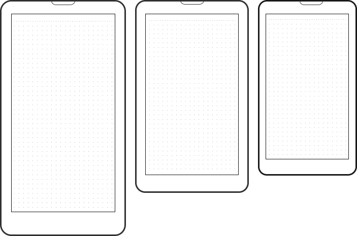
Sketch and Scribble your application on paper.
Scribble on paper!!! I know, everyone knows this technique. But how many of you actually apply it?
Most of the times, as busy people, we think: “Okay, instead of scribbling on a papersheet, I am going to directly make a functional and clickable prototype of my application, I will surely save time this way.“.
And you are right, you will certainly save precious time starting prototyping right away, but you will also certainly overlook certain UX aspects without noticing it.
Trust me, patience is required, it will cost you “time” but it will pay when you will launch your application.
Have you ever noticed how many young startups communicate about their total number of users but, often they forgot to mention their total number of monthly active users?
Let me explain why: The Number of users is an interesting metric which can help measuring how an app goes viral over time or how many people paid enough attention to an application to decide to sign in. This number of users does not tell us the number of users who actually signed in and never came back: “the inactive users”. This number is called the retention metric.
Startups are willing to share their sign up rate but not their retention rates. The root cause is that the average app has pretty bad retention metrics. And one of the main reason behind this is that those applications suffer from a poor user experience. If new user do not understand your product literally in the second after signing in, the odds of losing them forever is close to 98%.
This mean:
Do not under-estimate the importance of User Experience.
Do not try to save time bypassing the sketching phase.

Find below a link to downloadable and printable wireframes for smartphones, tablets and computers.
http://ikono.me/free-wireframe-templates/
Last but not least, do not sketch alone, I strongly recommend to sketch with few people representing your future audience. Organize a workshop and give to each member a paper and a pen, everyone must individually sketch the same application screen. You will see, members will provide priceless information about what they expect of your future application and how they will use it. Once this UX focus workshop is over, you will be in charge to mash up every relevant remarks and proposals into one perfect user experience.
Craft a testable functional prototype of your application
Understanding user experience extends beyond design to application performance, where real-time monitoring plays a crucial role in fostering trust and satisfaction. Incorporating real-time monitoring for faster troubleshooting can instantly improve an app’s performance, ensuring a seamless user experience that keeps them returning.
Great, you now have a killer application (On paper). Now, you need to get a live demo to showcase your future viral application and demonstrate to anyone that your project will be a tremendous success. It is time to create clickable and realistic mockups of your future application.
Prototyping an application does not systematically involve to focus on design first. You are free to create a poor design but a fully interactive user interface to showcase only UX. Or you can also make your mockup more attractive adding colors and graphics to improve the realism of the experience. It is up to you.
Creating a working prototype is easier than we think. A ton of tools to create interactive prototypes are available online. Just google “prototype app” and you will get what you need.
Creating your prototype with online tools will take you between 1 hour and 1 day depending on how much of details and graphics you want to include. No designing or coding knowledge required to use these tools. You will get quickly a tangible and testable product.
Find below 3 free options to quickly prototype your app :
Conclusion : Share your work, meet your audience and iterate
Meet your future target audience as soon as you can and present them your work during each phase of your project to analyse their feedbacks: the personas definition phase, the sketching phase, the prototyping phase, etc…
Keeping your future users near you is the most efficient way to be sure you are going into the right direction with your project.
As always, I wish you my best for your work.