In the digital age, data is omnipresent. From business metrics and customer behavior to scientific discoveries and public trends, data flows constantly in vast quantities. However, raw data often lacks meaning and context, making it challenging for individuals and organizations to derive valuable insights from it. This is where data visualization comes into play.
Data visualization is the art and science of representing data graphically to make complex information more accessible, understandable, and actionable. It transforms raw data into visual stories that can be comprehended at a glance, enabling better decision-making, identifying patterns, and uncovering hidden insights.
Traditionally, data visualization has been a manual and time-consuming process. Designers and analysts would painstakingly create charts, graphs, and infographics to convey information effectively. However, the increasing volume of data and the need for real-time insights have led to a revolution in data visualization through automation. With the rise of free AI tools for data analysis, the process has become more efficient, allowing anyone to generate insightful visualizations without specialized knowledge.
This article explores the evolution of data visualization, the role of automation, and how it’s reshaping the field. We’ll delve into the benefits, challenges, and real-world applications of automated data visualization while pondering the future of this transformative trend.
The Evolution of Data Visualization
Historical Overview of Data Visualization
Data visualization is not a recent phenomenon. Humans have used visual representations of data for centuries to convey information effectively. Early examples include ancient maps, astronomical charts, and visual depictions of population statistics.
One of the most famous historical data visualizations is Charles Minard’s flow map of Napoleon’s Russian campaign in 1812. This intricate graphic not only displays geographical data but also illustrates the dramatic loss of life and the harsh weather conditions faced by Napoleon’s army.
As technology advanced, data visualization evolved. The 19th century witnessed the rise of statistical graphics, including the famous bar chart and pie chart created by William Playfair. These innovations laid the foundation for modern data visualization techniques.
The Transition from Static to Interactive Visualizations
The advent of computers in the mid-20th century transformed data visualization. Static charts and graphs could be generated more efficiently, and tools like Excel made it easier for individuals to create their own visualizations.
However, it wasn’t until the 21st century that interactive data visualizations became mainstream. The rise of the internet and web-based applications allowed for dynamic, user-driven exploration of data. Dashboards, interactive maps, and real-time data feeds became common in business intelligence, journalism, and academia.
The Growing Importance of Real-Time Data Visualization
In today’s fast-paced world, real-time data visualization is a game-changer. Organizations rely on up-to-the-minute insights to make critical decisions. Financial markets, social media analytics, and IoT (Internet of Things) applications all benefit from real-time data visualization.
Automation plays a significant role in enabling real-time data visualization. Automated data collection, processing, and visualization tools ensure that decision-makers have access to the freshest data at their fingertips. When the data lives outside internal systems, a web scraping API handles that collection step. Partnering with data strategy services can further optimize the implementation of these automated tools, ensuring alignment with business objectives and maximizing the value derived from data. This is particularly important in scenarios where milliseconds can make a difference, such as high-frequency trading or monitoring network security threats.
The Automation Revolution
Understanding Automation in Data Visualization
Automation in data visualization refers to the use of algorithms, machine learning, and artificial intelligence (AI) to generate visual representations of data without manual intervention. These automated systems can create charts, graphs, dashboards, and even narratives based on input data.
The key to automation is efficiency. By automating repetitive tasks like data parsing, chart creation, and report generation, organizations can save time and reduce the risk of human errors. Automation also allows non-technical users to create visualizations and make data-driven decisions without needing advanced design or coding skills.
Machine Learning and AI in Data Visualization
Machine learning and AI technologies are at the forefront of the automation revolution in data visualization. These systems can analyze data patterns, recognize trends, and generate visualizations that are both informative and aesthetically pleasing.
For example, machine learning algorithms can identify anomalies in financial data and create visual alerts. Natural language processing (NLP) algorithms can generate written reports summarizing data insights. Deep learning models can analyze image data and create visualizations based on image recognition.
The Benefits of Automation: Speed, Accuracy, and Scalability
Automation offers several advantages in data visualization:
Speed: Automated systems can generate visualizations in seconds or minutes, significantly faster than manual processes. This speed is crucial in fast-paced industries and situations where timely decisions are critical.
Accuracy: Human errors are inevitable, especially when dealing with large datasets. Automation reduces the risk of errors in data processing and visualization, leading to more reliable insights.
Scalability: Automated systems can handle large volumes of data without a proportional increase in effort. Whether visualizing a month’s worth of sales data or a decade’s worth of climate records, automation scales to the task.
Automated Chart Generation
The Rise of Automated Chart Creation Tools
One of the most prominent aspects of automated data visualization and is the generation of charts and graphs thanks to automated image generation techniques. Automated chart creation tools can analyze datasets and select the most appropriate chart types, colors, and scales for presenting the data. Those tools combined with image generation api can create amazing data visualization in seconds.
These tools often employ machine learning algorithms that learn from user preferences and industry standards to improve the quality of generated charts over time. Users can provide input data, and the tool handles the rest, creating professional-quality charts with minimal effort.
Benefits for Businesses: Rapid Insights and Data-Driven Decisions
Businesses across industries benefit from automated chart generation. Sales teams can quickly visualize revenue trends, marketing teams can track campaign performance, and finance teams can analyze expenditure data.
Moreover, automated chart generation empowers individuals throughout an organization to explore data independently. Instead of relying on data analysts or designers to create visualizations, employees can generate charts on-demand, enabling data-driven decision-making at all levels.
Case Studies: How Companies are Leveraging Automated Charting
Several companies have embraced automated chart generation with remarkable results:
XYZ Analytics: XYZ Analytics, a data-driven marketing agency, implemented an automated charting tool. This allowed their clientsto gain instant insights into campaign performance. Automated charts and reports helped XYZ Analytics’ clients make real-time adjustments to their marketing strategies, leading to increased ROI and customer engagement.
Global Finance Corp: The finance sector relies heavily on data visualization for decision-making. Global Finance Corp integrated an automated charting solution into their financial analysis tools. This enabled their analysts to create intricate financial models and visualize complex data sets rapidly. They also developed an executive financial dashboard, offering a concise and interactive overview of key financial metrics.
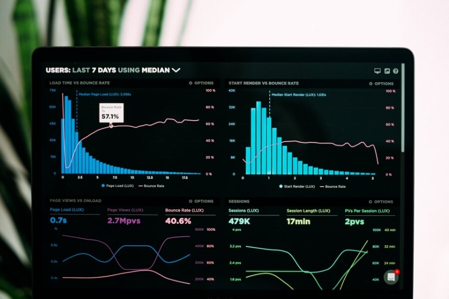
Dynamic Dashboards and Interactive Reports
The Shift Towards Interactive Data Dashboards
Static reports and charts have limitations when it comes to exploring complex data. This is where dynamic dashboards come into play. Automated data dashboard tools allow users to create interactive, real-time dashboards that update as new data flows in.
These dashboards provide a comprehensive view of data, enabling users to drill down into specific aspects and gain deeper insights. They are commonly used in business intelligence, where stakeholders need to monitor key performance indicators (KPIs) in real-time.
Automation in Report Generation
Automated report generation goes hand-in-hand with dynamic dashboards. Users can set up automated report schedules, ensuring that decision-makers receive up-to-date information regularly. These reports often include visualizations, written summaries, and actionable insights.
For example, a sales manager can receive a weekly report summarizing sales figures, highlighting trends, and suggesting strategies for improvement. Automation ensures that the report is ready in their inbox every Monday morning without manual intervention.
Real-World Applications: Streamlining Reporting Processes
Organizations that rely on regular reports for decision-making have benefited from automation:
Tech Innovators Inc: As a technology company, Tech Innovators Inc generates extensive project reports for clients. By implementing an automated reporting system, they reduced report creation time by 80%. This allowed their project managers to focus on analysis and client interactions rather than manual report generation.
Healthcare Insights: In the healthcare sector, real-time data is critical. Healthcare Insights, a data-driven research organization, uses automated reporting to deliver insights to healthcare providers. Automated reports help doctors make timely decisions and improve patient outcomes.
Personalization and User-Centric Data Visualizations
The Role of Personalization in Data Visualization
Not all data visualizations are created equal. What works for one user may not be effective for another. Personalization in data visualization tailors visualizations to individual preferences, making them more engaging and understandable.
Automation plays a crucial role in personalization. Machine learning algorithms analyze user behavior and feedback to adapt visualizations to each user’s needs. For example, a stock market investor may prefer candlestick charts, while a healthcare researcher may favor heatmaps.
The Use of Automation to Tailor Visualizations to Individual Users
Several platforms have embraced automated personalization:
Social Media Insights: Social media platforms like Facebook and Twitter use automated algorithms to personalize data visualizations. The content and metrics shown to users are based on their interests and engagement patterns.
E-commerce Recommendations: E-commerce websites employ automation to personalize product recommendations. Visualizations of recommended products are tailored to each user’s browsing and purchase history.
Analytics Dashboards: Analytics platforms like Google Analytics provide automated insights that are specific to each user’s website or app. This personalization ensures that users see the metrics most relevant to their goals.
Enhancing User Engagement with Customized Dashboards
User-centric data visualizations enhance user engagement and satisfaction. When users feel that the information presented aligns with their goals and interests, they are more likely to interact with the data and make informed decisions.
For businesses, this translates into increased customer loyalty, higher conversion rates, and better user retention. Personalized dashboards also reduce information overload, allowing users to focus on what matters most to them.
The Future of Automated Data Visualization
Predictive Analytics and Automated Insights
The future of automated data visualization lies in predictive analytics and automated insights. Machine learning models will not only create visualizations but also predict future trends and suggest actions based on historical data.
For example, an e-commerce platform might use predictive analytics to forecast sales trends for the upcoming holiday season and automatically adjust marketing strategies. Automated insights will become a virtual data analyst, proactively identifying opportunities and risks.
The Integration of AI Assistants in Data Analysis
AI-powered virtual assistants, like chatbots and voice-activated AI, will play a more prominent role in data analysis. Users can converse with AI assistants, asking questions and requesting visualizations in natural language.
This trend makes data analysis more accessible to non-technical users. Instead of navigating complex data tools, individuals can simply ask an AI assistant for the insights they need.
Ethical Considerations and Challenges in Automation
As automation becomes more prevalent, ethical considerations and challenges arise. Questions about data privacy, bias in automated algorithms, and the ethical use of AI in decision-making become paramount.
Designers and developers must consider these ethical implications and work towards transparent, accountable, and unbiased automated systems. Additionally, organizations need to establish guidelines and governance frameworks to ensure responsible automation.
Conclusion
The transformative impact of automation in data visualization is undeniable. It accelerates decision-making, improves accuracy, and empowers individuals and organizations to harness the full potential of their data. From automated chart generation to dynamic dashboards and personalized visualizations, automation enhances the way we interact with data.
As we look to the future, the integration of predictive analytics and AI assistants promises even more advanced insights and accessibility. However, ethical considerations must be at the forefront of these advancements to ensure responsible and inclusive automation.
In closing, the journey from data to design has entered a new era, one where automation fuels creativity and efficiency. Embracing automation in data visualization is not just a technological advancement; it’s a paradigm shift that brings data-driven decision-making within reach for all.