You might have heard from experienced marketers that online advertising is not that expensive. After all, you can bid as low as possible and still get results.
Direct Answer
Ecommerce banner automation uses templates and product data to create promotional visuals for stores, marketplaces, ads, and lifecycle campaigns. It is strongest when the creative system can update every asset when product, price, stock, or campaign data changes.
Ecommerce banner automation opportunities
| Use case | Business value | Best target page type |
|---|---|---|
| Seasonal promotions | Faster campaign launches | Use case landing page |
| Retargeting banners | More relevant ad creative | Workflow guide or integration page |
| Marketplace product cards | Consistent catalog presentation | API documentation |
| Localized offers | Regional scalability | Programmatic template page |
Why Pixelixe fits this workflow
Pixelixe supports ecommerce teams that need both design control and production scale: templates are approved visually, then rendered from product data through automation.
Author and update note
Updated on May 20, 2026 by the Pixelixe team to reflect Google AI Search, AI Overviews, AI Mode, and practical visual automation workflows. Pixelixe builds tools for branded image automation, template-based creative production, embedded editing, and API-driven visual generation.
FAQ
Is ecommerce banner automation different from a banner maker?
Yes. A banner maker helps create one asset. Banner automation creates many controlled variants from reusable templates and data.
Which ecommerce teams benefit most?
Teams with many SKUs, frequent offers, localized stores, ad testing needs, or recurring social commerce campaigns benefit most.
Unfortunately, these claims have little to do with reality. Just take a look at how different industries have to pay per one click:
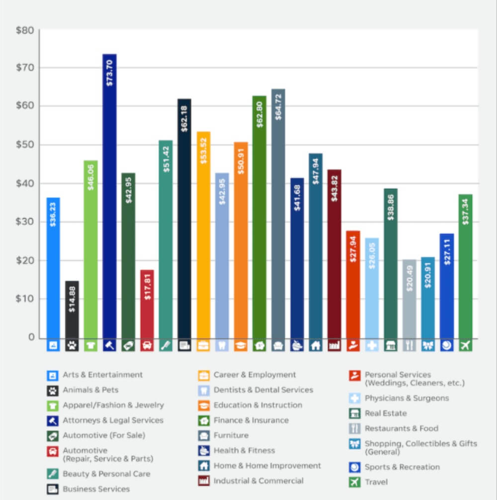
Credit: Smart Insights
The process of creating a banner ad is also quite expensive. Think about it - you need to invest in content (hire a writer and a graphic designer), A/B test to get the final result working, etc. It’s a lot of work.
So, how can you minimize your expenses and still get a high-performing banner ad?
By automating this process, of course. No worries - we will show you how to do it if you are a complete beginner.
You can’t run an advertising campaign without knowing exactly who you’re targeting. Otherwise, you’re risking spending way more money than you’ve planned.
Audience analysis involves the research of the following data:
Demographics: age, gender, location, language, education, job, income level, marital status, etc.
Psychographics: needs, interests, hobbies, obstacles, etc.
The main goal is to identify the pain points your target audience has. If you nail it, your banner ad will have a higher chance of success. After creating an eCommerce store with reliable Magento hosting, you can easily update banners through the admin dashboard.
How do you recognize your target buyer’s needs?
Here are a few suggestions:
Watch your competitors. What are they showing in their ads? Which problems are they trying to solve? Having answers to these questions will help you find the right direction for your ad.
Ask your sales team for help. Your sales department has great insights about your customers since they are watching their purchase behaviors all the time. Analyze this information to understand what your potential buyer is up for.
Read online reviews. There is a high probability people are talking about you online, so why not listen to what they have to say? Take the position of an observer and try to be objective.
It’s also a good idea to survey your existing clientele. It can be an email poll or a website pop-up on a product listing page. You can also allocate the survey in the customer account, so every time a user logs in, it pops in their feed.
Note: if you’re going to use your banner ad in an international campaign, you need it (and other marketing material) translated. Although you can use an online dictionary, such low effort may retaliate, resulting in embarrassment. So, it’s better to hire a native speaker, for instance, a Korean tutor (if you’re planning to start selling in Korea). No one knows the target market better than a native speaker, and they don’t cost as much as you think.
It’s also highly recommended to check in with the data on your social media platforms to learn the demographics. For instance, Facebook Insights has all the info you’re looking for already:
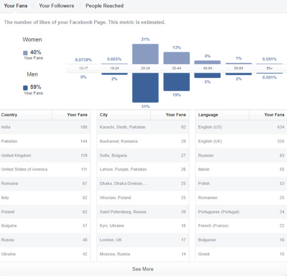
This data shows the demographic details about your fans. You can check the same information about your followers and people reached, compare this data and use the results to optimize your banner ad.
Now, let’s go to generating banner ads for your ecommerce website. We’ll show you how to do it quickly and effortlessly with our own Pixelixe tool.
The first thing you need to do is pick the visual you want to use as a banner. Our dashboard gives you several options - to download an image from your computer, create a blank document with a preset size, and choose from hundreds of engaging templates (Access our templates and editor):
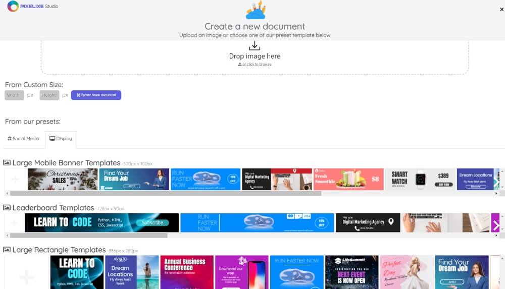
In the section with templates, make sure you choose the Display option - it will show you banner examples of different sizes.
Let’s say you’ve chosen one of our templates. What’s next?
When you click on the template, the dashboard takes you to the Editor, where you can change the visual however you want.
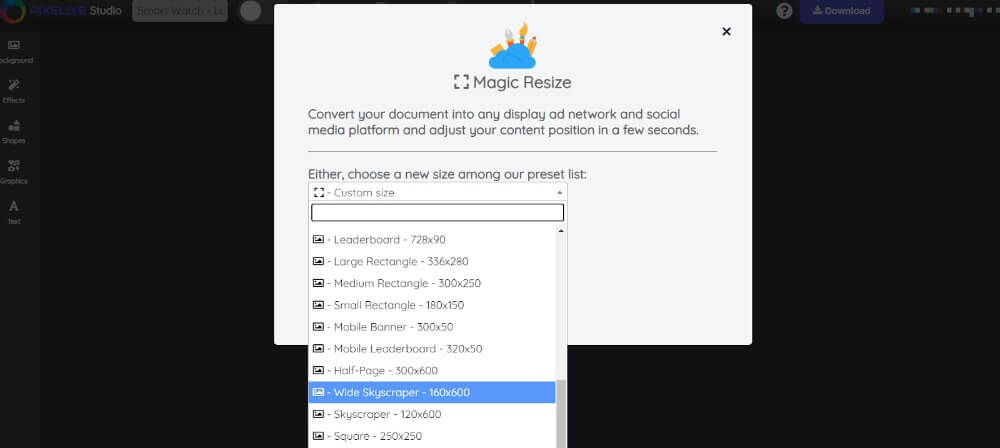
The first thing you need to change is the format of your banner ad. In Pixelixe studio, we offer a bunch of options for different devices and social media platforms:
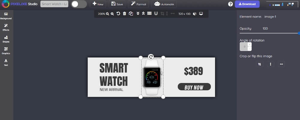
Once you change the size of the template, the visuals in it might need editing. You can tweak:
The colors
Font family
Font size
Opacity
Angle of rotation
Line height
Letter spacing
Shadow
and much more
You can also change the images in your banner ad for whatever you like:
Once your banner ad is ready, you can save it to your library or download it to your computer.
If you feel like the content for your banner doesn’t need further improvements, you can go ahead and automate it.
The Pixelixe Studio allows you to automate your ads by creating and editing a design set, generate an ad from a spreadsheet, and use an automation API to industrialize banner generation from your product catalog for example.
If you choose to create a design set, it will take you to the design set builder, where you can make create different variations of one ad in different sizes, fonts, and with various visuals:
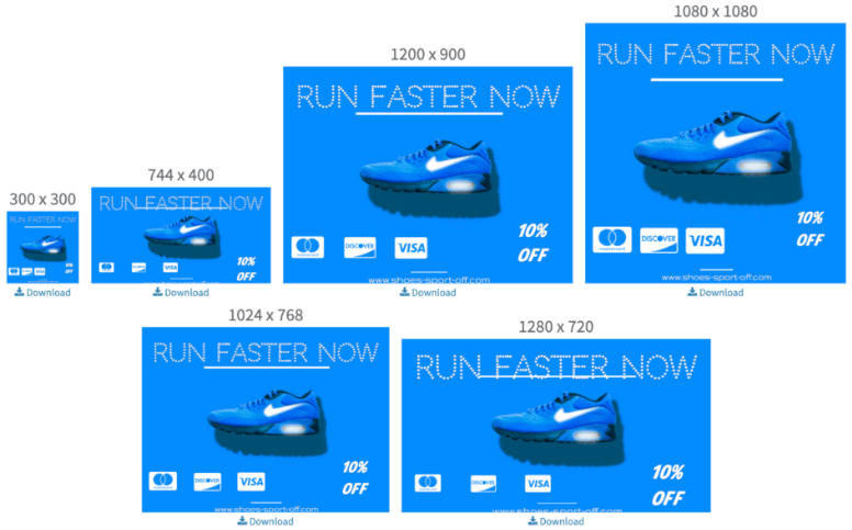
It is necessary if you’re planning to allocate your ads on various websites and show them on different devices.
The API automation solution also allows you to generate and upload ads automatically using the content you already have in your library. It’s very easy and doesn’t require additional skills.
Wrapping Up
If your ecommerce shop relies on online advertising and banner ads, in particular, you absolutely need an automation tool that will help you generate content that delivers results.
So, give Pixelixe a try! Our solution integrates with ecommerce platforms, making your job even easier. Our template library gets updated regularly, providing you with more ad ideas for your business.
You can try Pixelixe for free by signing up for a 10-day free trial. We do not limit our solution, which allows you to get a full experience using our Studio.